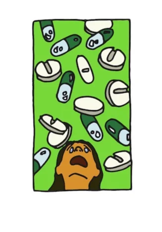
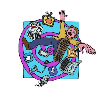
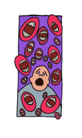
Visualising the abstract.

The weekend storm has faded, and the sun soothes in through the window. My newly potted basil seems to approve, and I entertain the notion that this time I won’t kill it (I believe I have anti-green fingers).

I begin the Monday shuffle, sorting drawings, references, pens and pencils; plugging in laptops, tablets and lightbox, and complete my daily to-do list. I like to-do lists - they help to regulate, to make sure I am free to improvise - to be agile without forgetting the  basics (in my case carb counting and insulin 🤷🏻‍♂️). 

fig.1: Germs: Wash Your Hands (St Giles Medical) [Wip]

fig.1: Germs: Wash Your Hands (St Giles Medical) [Wip]

My work since Diabetes: Year One  has been based around imagining ideas; visualising concrete and abstract research and concepts in different disciplines: from medicine [fig.1] and archeology [fig.3], to environmental science [fig.4] and history [fig.5]. I approach all this as a lay expert, as a patient, as the curious and as a communicator. My job is to ask questions, of the topic, and myself. To question the details and the obvious, to confront my own assumptions, but also to add my voice to the conversation. 

fig.2: Thumbnails and Drawings. [Wip]

fig.2: Thumbnails and Drawings. [Wip]

There are loads of ways to begin to interrogate ideas, but my work is filled with the language of comics - character, movement, gesture, framing and lettering, so I tend to think best through thumbnail sketches in response to the research, and the thinking - where the coffee and staring into the distance comes in. But these are the notions, the quick thoughts; the thinking proper comes in making these sketches into drawings: correcting lines, finessing facial expressions, adding tonal layers, judging the composition and solving unseen problems [fig.2]. 

fig.4: “Factory”: Carbon City Zero (Manchester Metropolitan University) [Wip]

fig.4: “Factory”: Carbon City Zero (Manchester Metropolitan University) [Wip]

In some cases, these are specific images - such as figures 1 and 4, where a concept is isolated in an image, where considerations of audience and intent are wrapped around the detail of research, or the ambiguity of a concept. In these examples l have made decisions about standardising lines through illustrator [fig.1], or keeping the scan and wobble of my own hand [fig.4]; finding the right colour tone to speak to audiences, and how to balance my conflict between enjoying complex detail, and clarity of communication. The images display my personality in the characterisation and world building that emerge in adapting my aesthetic to a brief. Blending the relatable with slapstick and dark humour; colliding elements like the contrast and depth of shadow, with the tonal play and dissonance of colour; all these elements allow my imagination to play with the ideas, facts and theories that are put before it.

fig.3: Pre-History to Primary Schools: Iron Age page 3. (Manchester University). [Wip]

fig.3: Pre-History to Primary Schools: Iron Age page 3. (Manchester University). [Wip]

In other examples the research is theorised and embedded into narrative that tests or strips back the meaning to different readers and viewers [fig: 3 & 5]. Here I use different mediums to find different textures that, along with colour decisions, are important to guide and energise the narrative. The scraping of pen and ink against the resistance of the page creates a tension, but also forces a quickness of mark making that is both free, but also perilous [fig.5]. Whereas the laying of coloured pencil requires the images to build and build, creating a tension with the pace and action of the story [fig.3].

As comics, these examples bring in elements I’ve discussed before, such as pacing and rhythm through paneling, and the nature of the lines and marks. In these narratives there is the concern to depict the events and the story, but there is also the visualisation of texture, which is akin to the sub-text of the story, a deeper level of communication beyond ‘just the facts’.

fig.5: Voyage of the Scotia (Magic Torch Comics; Author Paul Bristow)

fig.5: Voyage of the Scotia (Magic Torch Comics; Author Paul Bristow)

All these decisions reflect my own struggle to understand the topic on my own terms, to insert myself as an outsider into the narrative, and in doing so to communicate to others.

These projects reflect different styles and mediums, but I feel now there is an aesthetic I can begin to touch, a blend of the surreal, the naturalistic, graphic design and cartoon; an aesthetic that is developing from facing new ideas, new areas of knowledge. An aesthetic that has grown from being forced to know type 1 Diabetes, and perhaps myself a little better.
Time-shifting

I’m running late this week - tossed and thrown by the eccentricity of the Easter weekend and the effort to return to normality. In this spirit this post is about why I wanted to include drawing history as part of Diabetes: Year One. 

The section covers three pages [fig: 1-3], but takes us from the Egyptians to the present. The pages are a mix of morphing through discoveries and misconceptions, and one-pages to arrest the continuum and consider firstly the impact of insulin, and then the potential for the future.

fig. 1: Diabetes: Year One, page 47

fig. 1: Diabetes: Year One, page 47

History is not infallible (I know I’m married to a history teacher), but it helps to provide a context, a way of re-rooting after the shock of disease. The first page [fig.1] may rush through history, but on its way it acknowledges both the horror and the humour: the impact of neuropathy, the grotesque images of melting flesh that accompanied early understandings; and the dark humour of the term “pissing evil” as diabetes was known for a time (Oh, FYI my phone is still shocked, insisting it should be ‘pudding evil’, for which I have no words #languagematters). On the way the page notes the medical milestones and stumbling blocks, before the importance of the pancreas came to be understood (and yes, it is a pancreas!). But this historical helter-skelter is also part of me coming to understand the science and the medicine - finding the human touches in the experience of Diabetes, and coming to see it in terms of more than myself, understanding the social presence of disease.

fig. 1: Diabetes: Year One, page 48

fig. 1: Diabetes: Year One, page 48

As I’ve mentioned drawing is discovery, and in celebrating the invention and inventors of insulin, which is literally keeping me alive, I found the image of the playing card [fig.2]. The image is an Ace - a card that dances with duality as it is both high and low. There is tension in any reflected image, and though they are joined through the pattern of testing strip foil in their waistcoats, I emphasise Banting and Best's own acrimony through the red outline; but also touch on the issue of being beholden to a drug for life, and in turn the issue of access in private healthcare systems, which fortunately is not something I have to deal with, but something I am very aware of:

“… the present struggles to contain the conflict of past & future. To measure and judge rationales and vested interests.”

Through drawing the past I again find myself reflecting on the place of disease in society, and as a result on my own place. Leading me to…

fig. 1: Diabetes: Year One, page 49

fig. 1: Diabetes: Year One, page 49

… The Diaborg [fig.3]. I’ve considered what this image meant to me in terms of my relations to the body in other posts, so for this post I’ll just note a couple of things. Mainly that the pose is an Homage to the Rodin’s the Thinker (though with added bathos and cluelessness), and that the image is uses my pencil drawing that inspired the final cover image. In other words - the image is about figuring it out, and the role drawing and art has in doing that.

Elements of the Diaborg point to the future, and represent the present, but it serves as a reflection on the past, and on how the past shapes our ability to define ourselves for the future. To ignore the past would take away the grounding of any discovery; so while this section is relatively short, I knew I had to include it, to picture myself in my “new narrative”, to pin down the overwhelming.

Process Piece.

Monday rolls around again, with the dull thud of a head hitting itself against a wall. I find myself, out of the house for inspiration, two espressos down, staring at a blank page. Worse, I’m trying to ignore the page to my left, where the attempt I rushed off to try and get an idea started is smirking back at me; basking in the fact that it offends me both as an approach to a new project, and as a reflection of my technical ability. One result of this, is that this will be a (relatively) short post. 

This stage of the process is frustrating. I thought I had a handle on the way forward, but it doesn’t feel right, so I need to start again. As I write, I’m trying to decide between rescuing elements I think may have something to add and decreeing a new set of constraints to build something new.

I know I’ll start again with thumbnails. The process of collating all my ideas only really happens when I start to draw out little disasters and I can see little moments of joy, horror or slapstick jumping out. This might be a finished scene, or the sweep of a line, or an expression on a face, or an inkling of perspective, but for me it will start with these drawings: small, cramped, unfinished, generally full of energy and overly complex. But from here I’ll start to take away, to refine, or to edit my ideas, looking for clarification. One of the reasons I like thumbnails is the way I can use frames to compartmentalise ideas or fragments that would become lost in a larger scene.

This compartmentalisation came from creating Diabetes: Year One, which for all the methods and themes I’ve explored, is ultimately about me trying to understand the relationship between illness and the emotional tumult of living. My creative process has always ridden the knife edge between hyper-self-awareness, and the need to get on and do; a process that needs to research and reflect, but one that needs to confront an impending deadline. This interaction between analysing and acting is how I approached type 1 Diabetes – for me to know is to draw, and to draw is to understand. In other words, it’s all very well doing the reading, and checking the numbers and all that, but I only realise what’s going in, when I see it coming out (This feels a bit scatological for a Monday morning, but I’ve spent the weekend with 9 year olds).

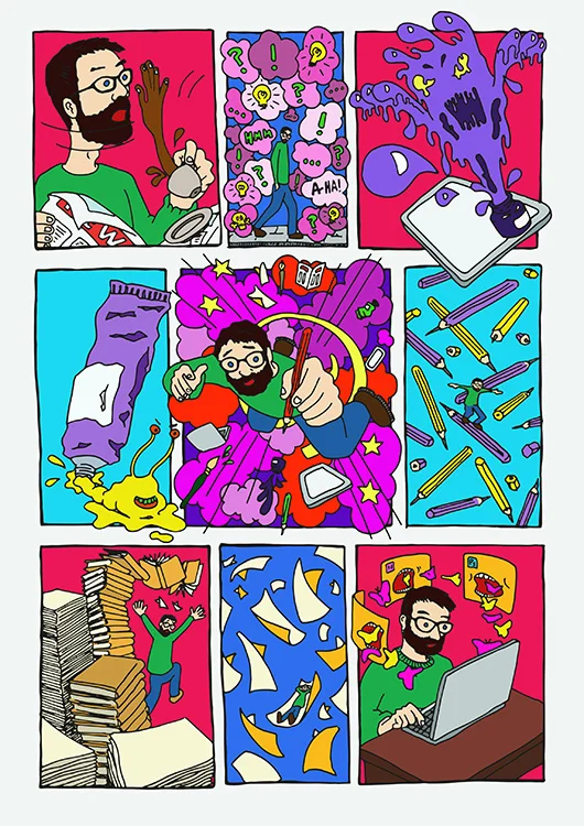
After the thumbnails the options broaden out, but in some way I’ll cover the basics – composition, style and colour. How I do it will vary. I drew this calling card sequence [fig.1] to reflect the facets of this process.

fig.1 ’Pick-Art’ Calling Card.

fig.1 ’Pick-Art’ Calling Card.

The image deals with the interaction between the world around me and the world in my head; the relationships between different media and equipment; the structure that lies beneath my surrealism; and also – cos’ I tend towards melodrama, the excitement that rises from despair. In this case the pencil, and ink drawings are put through illustrator and coloured in photoshop, adding to the slapstick through the Beano-esque line and flat colour style (though the vividness of the colour is all mine), all designed around a cross structure nicked from chapels in the renaissance style (btw – totally comics!).

The final image I enjoy because of the energy, the humour and the absurd that touches on the grotesque, but mainly because I think it takes the various aspects of my work and personality, yet creates a single sequence that is, well… me.

Body language.

The sun paints the room this morning. Spreading a yellow sheen over objects and things that are familiar, generating a glow of optimism which I feel as I stretch and shake away the sleep. I look around as I take out the bin and reflect on changes I want to make to myself.

I bought running stuff yesterday – tops, shorts, trainers, and importantly a utility belt. I had a brief period way back before diagnosis where I did some exercise – some yoga, enough running to get me round the great north run (in no sort of time, but I didn’t die, so target achieved), but I’ve always felt self-conscious doing ANY form of exercise, I feel a fraud at best, and a fool more often. Type 1 Diabetes brings another element however, I need to do exercise to keep on top of my health, but I am really scared about having a hypo running by myself – will I recognise it whilst I’m sweaty and out of breath, will I react quick enough, will I be able to get around okay? This is where the Batman belt comes in – carrying my tester, strips, and sugar. I have a plan – including eating before I start (no insulin – I don’t want to store stuff, I need to use it), slow, short test runs with lots of test included to get a sense of the impact on my metabolism. This will be a new chapter for me, but my relationship with my body has been complex from the beginning. 

 Type one Diabetes is an illness that highlights a breakdown between the self and the body – you can no longer assume the body will support your actions, and indeed you find yourself in a position of care for the working of your internal systems. In drawing Diabetes: Year One I was researching my new relationship, imagining who I am, but also reflecting on who I have become.

fig.1 Diabetes: Year One, page 38.

fig.1 Diabetes: Year One, page 38.

 In these examples I see my body as grotesque and alien, something outside of me. The B-movie vampire [fig.1] is a response to the absurdity of having eye-drops and wearing sunglasses on a decidedly overcast day (hence the graphite colouring), and how that necessary act becomes a fashion statement and in turn a self-conscious act. The focus on eyes alludes to the potential complications of type one Diabetes (and an important layer of the comic bound up with another fear of possibly losing sight as an artist). I wonder also if the ideas of Diabetes and Vampires, is a subconscious consideration of messages that are constant about the cost of Diabetes to public-health? Whether the image is accepting, or challenging those messages I’m not sure - but I suspect, with my temperament, the latter.

fig.2 Diabetes: Year One, page 49.

fig.2 Diabetes: Year One, page 49.

Here I draw myself as the ‘Diaborg’ [fig.2] referencing science fiction by creating a robotic armour from Diabetes equipment, but also hinting at the Tin Man from Oz in its pose. The image is both futuristic and wistful. This is a figure of internal conflict and uncertainty, a ‘self’ in flux. Coated in the trappings of diabetes, the image refers both to the day to day stuffof Diabetes, and the hopes that spring from scientific research; new ways to manage – or even in some cases attempts to cure type one Diabetes. Technological possibilities that either look to ‘build’ onto the outer shell of the body – like pumps and flash monitors; or insert new bio-engineering inside it – such as ß-cells transplanted and surrounded by a protective oxygen shield to keep out the murderous and self-destructive T-cells. 

fig.1 Diabetes: Year One, page 52.

fig.1 Diabetes: Year One, page 52.

In contrast these holiday photo-snaps from the final section of the comic [fig.3] shows my body more as it is, filling out, as the insulin is able to hold the energy of carbs and sugar in my body as Glucagon. Whilst the early images attempt to imagine my new relationship with my body, these images show is my body in action, in the process of doing – they reflect on what is happening, and acknowledge success and achievement to dilute the anxiety and doubt. 

Diabetes: Year One articulates and acknowledge these points of separation between the self and the body, visualising the unseen and the ways in which I come to know it. This consideration and negotiation of the outside reflects the way in which I am constantly negotiating my notions of ‘self’ between patient (diabetic) and person living with diabetes (PLWD). So, I guess I will pull on the trainers, I will strap on the belt, accept the inevitable out-of-breath-ness, and try to ignore the images of ridicule and ridiculousness that will hover at my eyes’ edge, and go for a run.

A numbers game.

The clocks have gone forward. It’s always the Monday when you notice - no Sunday snooze to mitigate the change in light, the morning stutter that just puts the break in summer proper for a while. 

I bumble around making breakfast, eyes bleary with auto-pilot. I fumble for paper and fill the machine with coffee and water, whilst performing the mandatory blood test to see how breakfast pans out.  

The fact that the ritual and it’s divine interpretation are natural to me now is a shock. I have imbibed options and ratios which now mean I can adapt to annoyances like running out of marmite, or forgetting to buy bread, by substitutions or other options. 

I’m afraid I’ve got into some bad habits with breakfast since  Diabetes: Year One. I’m sure porridge should be my go to, but we changed supermarkets and brands a few months ago, and I haven’t sat down to re-do the carb maths yet; so toast it is - fortunately this brand gives me the carbs per slice (not all do - and some food helpfully tells you the carbs per 100g, BUT THEN DOESN’T TELL YOU HOW MUCH THE PACKET WEIGHS IN TOTAL!!!), so I can match my carbs to my morning insulin ratio. 

Type 1 Diabetes changes the way you see food. It’s true you can eat whatever, but you can’t eat it blind. Keeping up with all this and trying to cook, eat or live spontaneously can be - is - overwhelming. So of course I had to find a a way to draw my relationship with food, and it’s changes.  

Food appears throughout in Diabetes: Year One in many aspects: as an unsovable maze [fig.1], a puzzle and adversary [fig.2], an accent to everyday life, as a tangible and slightly trippy presence [fig.3] and as a part of a holiday [fig.4].

fig.1: Diabetes: Year One, panel 2, page 51

fig.1: Diabetes: Year One, panel 2, page 51

fig.2: Diabetes: Year One, page 19

fig.2: Diabetes: Year One, page 19

fig.3: Diabetes: Year One, page 34

fig.3: Diabetes: Year One, page 34

fig.4: Diabetes: Year One, page 53

fig.4: Diabetes: Year One, page 53

Food is made surreal with colours that make strange or shock, and by the way it is surround by a dance of numbers and calculations. Visual statements that look at food as more than sensation, socialising or enjoyment, but look at how these elements are renegotiated by the constraints of type 1 Diabetes.

The sequences of comics speaks to how we think of food - we eat in sequences after all - a procession - starter, main course, pudding. Yet it also allows the reader to see the sequence as a whole - all together on the flat page, the way I’ve come to think of meals - after all if you don’t commit to a pudding from the outset, it’s hard to include it in the sums [fig.5].

fig.5: Diabetes: Year One, page 35

fig.5: Diabetes: Year One, page 35

(FYI - you can split doses, but so far I’ve tried to avoid that unless it’s the only way - it confuses my maths, and allows me too much potential to start improvising with the rules I’ve given myself). Cos Diabetes does it’s own thing, differently with each person this page doesn’t try to lecture, but focuses on my experience of carb counting - adding humour through a cartoony style, but adding an undercurrent of despair. 

The thing is I am a foodie - and I’m pretty grateful, it allowed me enough understanding of ingredients and techniques to adapt my food, and to help me calculate the impact of food when I’m out (including an understanding of what secrets might be involved - sugar hiding in tomato sauces, the importance of remembering the flour in the gravy and so on), but all the extra of diabetes does take it’s toll. So much so, that increasingly I find myself exhausted by the thought of cooking instead of excited, and if I’m honest, that disappoints me.

A new dawn?

The sun has arrived. Its beams flood the kitchen, bringing the gleam of spring and coating the washing up left over from last night with a layer of charm. For the moment the room, that has become increasingly oppressive with work towering over me like a half played Jenga, yawns and stretches, reaching into spaces unseen and unthought of to wake imagination, and illuminate the potential of things. 

This energising of the room brings me to reflect on the experience of being part of a drugs trial. Being part of a trial was initially something I was apprehensive of, but became an experience that I found empowering, and a stimulus to my own form of research in creating Diabetes: Year One. Soon into my diagnosis I was offered the opportunity to be a part of a trial – I had to move fast as the time from diagnosis to acceptance had to be quick. I said yes – partly intrigued, and partly wanting to do something pro-active in reaction to the passivity of diagnosis. 

Once accepted my experience was unorthodox, I was moving across the country from Newcastle to Manchester, so I had to agree to periodic journeys back. They worked with me, so that some of the appointments could be done over the phone, but there were still days of traveling. My trial included regular injections, and periodic infusions – designed to prolong any residue insulin production with the idea that it might have long term health benefits, all tested through a meal tolerance test (drinking a sweet malty milkshake and seeing how my blood glucose fluctuated as a result through regular blood samples). I don’t know the results, and probably won’t, but for me that wasn’t the point. I ultimately choose to continue based on research that suggests that keeping blood sugar levels in range soon after diagnosis has benefits in itself. This could be for many reasons – behavioural, physiological etc; but for me the benefits were psychological and authoritative. By this I mean I was able to ask many, many questions to experts, which gave me confidence to ask more questions, to ask stupid questions, and through this to gain a better understanding of how my body works – to see the complexity of connections that could be involved in making decisions. 

Being part of the trial for me was, I imagine, like being the car in a formula one team (I hope - full disclosure, I know nothing about cars!), that is, an essential and complicated part of the team, though not necessarily the one in control. My pages on the drugs trial move from the introspective, to the holistic – from dwelling on my own feelings [fig.1], to seeing myself as part of a wider community, and a part of society [fig.2 &3].

fig.1 Diabetes: Year One. pg.30

fig.1 Diabetes: Year One. pg.30

fig.2 Diabetes: Year One. pg.31

fig.2 Diabetes: Year One. pg.31

fig.3 Diabetes: Year One. pg.32

fig.3 Diabetes: Year One. pg.32

A journey that is reflected in the variations in layout, the juxtaposition of the realistic and the cartoon, and a move from sombre to expressive colours. The layout begins by expressing the puzzle of identity that the new diagnosis presents, then considers the nitty-gritty details of the trial, before exploding into the speculation and potential of medical research. Research, that though I don’t presume to be an expert in, I now feel I am an informed observer of, and so able to consider, engage with, and draw. The mix of realistic and cartoon, or surreal aspects reflects the way in which the imagination is stimulated by the process of the experience. 

Whilst some drugs trial may be problematic and need research and discussion before making your choice to participate; medical research in many forms is available, and some are as simple as questionnaires and surveys. Without my participation I’m not sure I would’ve found the confidence to express my own experience, to have the presumption that my experience could be of use to others. 

City Tales, a change of subject.

Waking, this morning, to a flurry of post-it notes and to-do lists, before crawling through the debris of projects in mid-realisation, I find myself up against time, and I pause – briefly, to think about where I am now. 

Creating Diabetes: Year One not only allowed my thoughts about medicine to develop, but also provoked my illustrative approach. I’ve touched on sequence and colour in other blogs, but a key feature of the thinking process of the comic, was to find a way to polish my slightly wonky sketch style. Additionally, I suspect, as a response to spending a lot of time with myself as subject matter, it felt good to look at the world outside for a bit.

 Cityscapes, urbanisation and landscapes have always fascinated me. The depiction of what is around me and the imagination of new worlds and places are ways of exercising the mind, whilst zooming into the details of logic and chaos; it is a way of thinking in wide-screen but working in close-up. I began the project City Tales as a personal project, a way to dive into the idea of place using methods and ideas from exploring graphic-medicine – and in particular a way to consider Cities as narrative. My first of these projects was Newcastle (technically Northumberland, Newcastle and Gateshead) [fig.1] – where I lived for 18 years. The sequence allows for a journey across the landscape – the frames providing snapshots for the viewer to impose their own narratives alongside my own memories and affections. The graphic colouring asks the viewer to reflect on the spaces around them, making them recognisable places, and I hope to imbue a sense of the rhythm of the Toon, through the way that the places pop out of the frame and ask the viewer to join in. 

fig.1: City Tales: Newcastle

fig.1: City Tales: Newcastle

Using frames in this way encourages me to consider the power of perspective and viewpoint, but also ask the reader to consider what happened to get them from an evening in the theatre, to the top of the castle, looking down on the cathedral? Newcastle is a city which lets you fill in the blanks in many ways. 

 I’ve always loved the sensation of discovering a new place, of going from not knowing where you are, to knowing what’s around the next corner. It’s a key part of the experience of travel to me. In creating the City Tales project, I am finding joy in the planning and engaging with the specifics of a building in the context of the wider city – the geography of relations. A mapping that is internal, then external, personal, and collaborative. 

 I’m currently working on a Manchester version [fig.2 & 3], where I’ve been for the last two and half years, and planning versions for other cities from my experience, which at the moment include: London, Bristol, Durham, York, Cardiff and Edinburgh – but the plans are fluid at the moment, and other work calls in the meantime.

fig.2 Manchester Studies 1

fig.2 Manchester Studies 1

fig.3 Manchester Studies 2

fig.3 Manchester Studies 2

Imagining the science bit.

There’s that moment in the morning, before the wide awake I can take on the world bit, when all is meh! Morning fog has fallen, and I’m moving on auto-pilot. Miraculously coffee papers are found, coffee is spooned, and water is poured, and then I stop and hope for the best.

Ask me a question at this point and you won’t get my best answer. You’ll be lucky to get more than unappreciative grunts. A little later as the bitterness and berry notes - and a fair wack of caffeine hits, you might begin to get some sort of sentences.  

Learning styles were popular for a while in the noughties, and may still have influence. I remember doing a test to check mine and it turned out that I really don’t like listening, reading or looking to learn - instead I need to do something, or talk at people to learn. I found this surprising at the time as my first degrees were in English literature. 

The thing about talking at people is - well, first of all people soon hate you, and second of all if you don’t listen to yourself you miss any of the good stuff you say. On top of that it makes you the stereotypical repetitive drunk as you try to work out what it is you are trying to say - I’m not talking off the cuff Wildeian wit here! 

And finally we’re at the point - why comics become such a powerful way of understanding. The collision of different ways to communicate allow me to explore the nuances of thought from inside and out. I’m thinking about the pages I drew to help understand what was actually happening with type 1 Diabetes. The medical and biological factors that are the cause of the daily experience. In this page [fig.1] I wanted to show the relationship between food - especially carbohydrates, and insulin.

fig.1: Diabetes: Year One, page 20

fig.1: Diabetes: Year One, page 20

The style is cartoony and dynamic, depicting an Inner Space (sci-fi film, 1987) adventure with lots of blood and nets to try and show a simplified version of what insulin does - taking glucose from the blood and storing it for when it’s needed. But there’s more going on here; to begin with this page was drawn later on in the creation of the book, and I’d already drawn pages that attempted to go into the process in detail (see below), so this isn’t a simple ‘what does insulin do?’ page, rather the Alice in Wonderland “rabbit hole” references, the hypnotic onion, and the trippy colours is my re-engagement with something you think you get, but then find yourself reflecting on as you realise this is saving your life; something that the day-to-day can obscure. The alien-esque insulin hormones are injected in a thunderbirds manner to rescue the situation, they are outsiders sent to help. Between the shadows, the perspectives and the breaking of the panels the page seems to thrust and recede as the adventure moves through excitement to banality with the final mouthful. The point being that I can be completely oblivious of what is happening, that without a way to imagine what is happening, the spur to treatment can be forgotten.

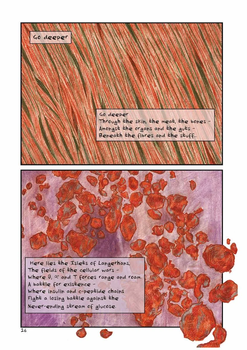
In other sections I try to take on the science more directly, breaking away from continuous panels to reflect longer on symbolic impressions of the conflict inside my body.

fig.2: Diabetes: Year One, page 26

fig.2: Diabetes: Year One, page 26

fig.3: Diabetes: Year One, page 27

fig.3: Diabetes: Year One, page 27

The texture of the drawing, tries to get a sense of the texture of the body, even as we get so small that it no longer registers in terms of ‘bodily mass’. In these pages the science and the impact are focused in the text, but they are anchored by the drawings, which give space to consider the words, and the meaning around the poem. The images still have movement, as sense of exploring the situation, but because of the size seem to evolve rather than rush.

Whilst these three pages consider the science from an insular perspective, the next pages attempt to explain type 1 in a more outward form - bad couplets:

fig.4: Diabetes: Year One, page 28

fig.4: Diabetes: Year One, page 28

fig.5: Diabetes: Year One, page 29

fig.5: Diabetes: Year One, page 29

This time the images alongside are not designed to do the explaining. The idea of the image was to consider a gestural response to the emotions that go alongside the science, so this patterning or sequence echoes the chatty rhythm and rhyme of the poem, but provides a counterpoint to the upbeat rhyme, with the melodrama of the more extreme gestures. The impact of the colour and the rubbing out gives a sense of cave drawings, suggesting, I think, a more instinctive relationship between the patient and the disease. The image was drawn as a whole page, but then broken into panels - again granting the reader agency in terms of the time that passes, and the effect of that time passing on the repetition of the pose - intensifying the impact as time passes, but the emotion does not.

I wanted to draw the science, as I think understanding what’s happening is important, and lets you understand what you need, or want to do. I don’t think making a comic has given me any medical expertise, but it has given me agency in terms of understanding how the medicine, and the science relates to my experience - and I did get it checked out, to make sure I’m not saying anything wrong! It has given me the confidence to engage, and express how I think type 1 Diabetes pertains to me; and from the feedback I’ve had I think it speaks to others in a form that at least allows them to imagine illness for themselves.

Thinking back to my last blog, for me the conversations, and advice, and research only really began to come together when I started to do something with them. In making the comic, and talking to others, I’ve become really aware of patient experience, and the difference it can make, and that, like user experience design (UX), patient experience design (PX) should be developed and evolved; and yes, I think comics can be a varied and subtle part of that, but, also, embracing the patient as person needs to be at the heart of it.

Particles of thought.

A novel situation for the blog this week. I’ve been asked to write a bit more about my response to advice in Diabetes: Year One, something I thought about a lot when I was drawing/writing/designing the book and is a bit of a bug-bear of mine, so my immediate response was yes – of course!

Okay then…

 Turns out ‘bug-bear’ is another way of saying lots of thoughts that zoom and rant at each other colliding in a disorganised mess. Honestly there are particles of thought all over the place! So, I decided to go for a walk. 

 Trudging upward I found myself surrounded by a soundscape: the hiss of breath, the rhythmic thudding footsteps, the distant zoom of car engines, and then suddenly a cacophony of tweeting birdsong as I walked under a small canopy of trees. All of which brings me back to topic – what part did advice, and my response to it play in visualising my Diabetes?

 Before I get into my drawings, I suppose I need to contextualise type 1 Diabetes a bit. It’s a chronic disease – which means it won’t get better. It’s an auto-immune condition – the T-cells have decided the insulin producing Beta cells are a threat and have decided to kill them off. You have to calculate, adjust and take insulin for the rest of your life. My point is, does advice look the same to someone just diagnosed as to someone living with the situation for 5, 10 or 50 years? 

 I also need to make clear that advice is a “multi-modal” pathway – it comes in leaflets, through conversations with different types of healthcare professionals, on websites, through videoes and through patients’ groups, and I’m pretty sure one way won’t work for all people. 

But I did not respond well to leaflets – I got loads, and most of them remained on the side of the kitchen counter. Medical communication to patients is often based around the philosophy of bullet-points. I hate bullet-points, they’re all about striping away experience, making things matter-of-fact – manageable. Yes, they have a place, but they deny emotion, and in doing so can provoke emotions that obscure the good they’re trying to have. The real problem with advice is the mistake it makes between ‘information’ and ‘understanding’.

 This need to chart experience, not just a disease, is the reason why I was drawn to comics, after-all they are also “multi-modal”, they have pictures, sounds, words and can be on paper or online; but they also demand the reader engages with the different strands that are in front of them, and make links, to be a part of the process.

 To put this into a bit of context let’s look at a few pages. When I was diagnosed I was given a lot of information (have a look at all the leaflets and data on page five in the post The Tyranny of the Line), but I was also put in a lot of situations that were unfamiliar to me. Now, here’s the thing, I’ve had an education, and I would say I verge on the arrogant in terms of assuming I can understand something, which means I don’t like to ask, or to admit I didn’t ask the last time, because I didn’t know the question. This tendency is intensified when I’m feeling vulnerable or defensive. So, while I can definitely acknowledge I have a lot of work to do on me, I want to think about the way in which advice works. 

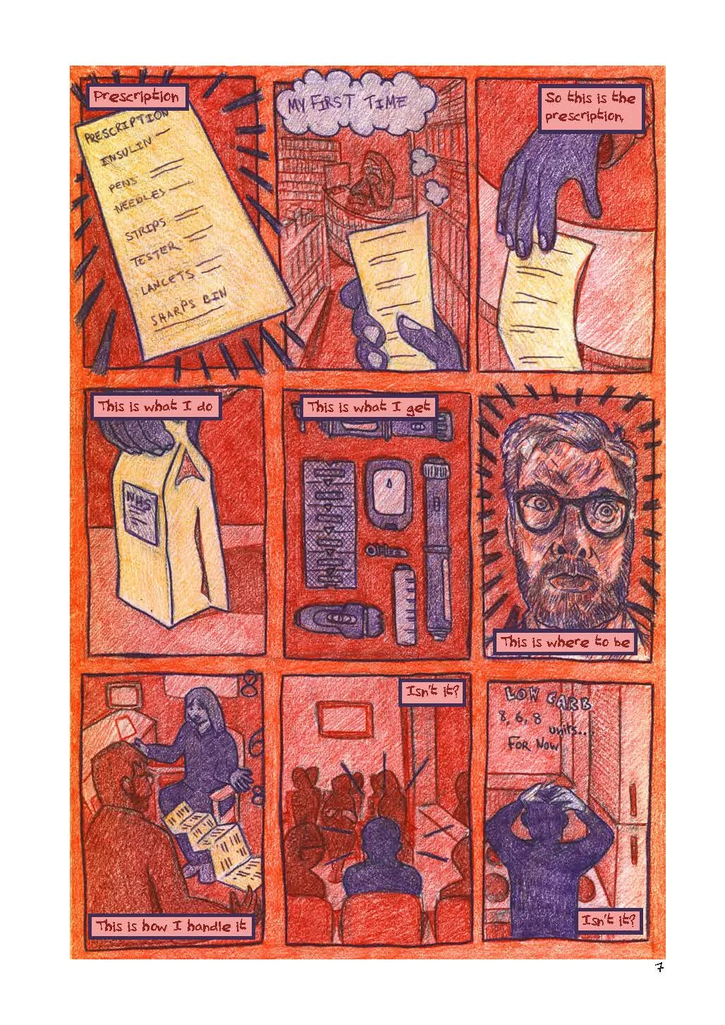
 Here I think there’s a couple of points – time, and interaction. We see these in the page “prescription” (pg.7) [fig:1]. The page is in the nine-panel grid – allowing the reader space to put in the time gaps between the events – these are regulated in space, although they may vary in terms of the amount of time between each event, which gives a staccato rhythm to the events. The point of view in the page is passive – I would argue even passive-aggressive when we consider the context of red/orange background. Pieces of paper stand out, whilst agency is imbued with purple to objects, and people. Only in panel six is the forth wall broken, suggesting that the narrator doesn’t have the control that the text suggests, and shows how the events around diagnosis start to build up a psychological response to receiving advice. Is the patient in panel 7 really taking in what they’re being told?

fig:1: Diabetes: Year One, pg.7

fig:1: Diabetes: Year One, pg.7

 The following pages [fig: 2-4] again look at patient involvement when it comes to advice.

fig:2: Diabetes: Year One, pg.14

fig:2: Diabetes: Year One, pg.14

fig:3: Diabetes: Year One, pg.15

fig:3: Diabetes: Year One, pg.15

fig:4:Diabetes: Year One, pg.16

fig:4:Diabetes: Year One, pg.16

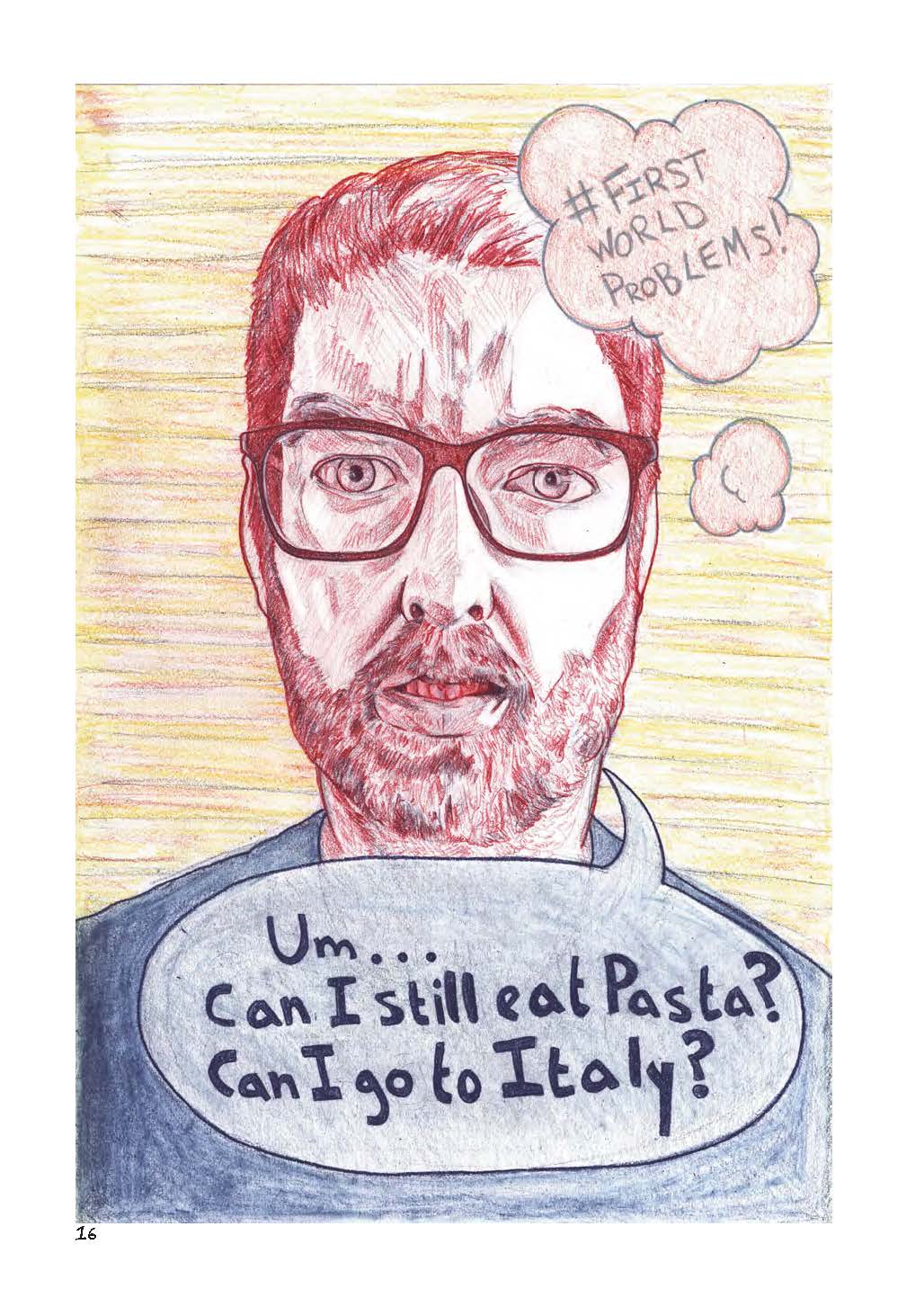
The opening conversation considers a few things. I’ve put a notebook in my hands on this page – mainly because it’s a form of interaction, and I know I’m not listening if I’m not writing or drawing something down. But the placing of the dialogue, in the middle of a honeycomb, surrounded by bees, suggests that it is distant – an impression that is increased by the need to read the footnote at the side. This distance is increased over the next two pages, where the idea of what is right and wrong to ask is explored – with all the possibilities played out in my head, before the absurd, but true, questions that are asked about “pasta” and “Italy”. Shifting from the cartoon to naturalistic images I want the reader to begin by echoing my confusion, and then to pull away to see what that looks like to the outside, to see how what is a patient process, might be perceived as incongruous to from the other side (The questions also nicely set up the end of the comic, but that’s not really the point). 

 All this may seem critical, and it is, a bit, but I want to make it clear, I had a lot of useful contact and advice, and everything I received was well intentioned, but that makes me ask why didn’t I take it in? I mentioned time – and I know that one-to-one contact by definition is stretched in healthcare provision, and I’m not sure it would be good for me as a patient to have someone on speed-dial. But strategies of communication can allow for more ways for patients to process their feelings, so that they can understand their situation, and begin to make self-initiated choices. For me ‘comics’ is a medium, but it is a medium with such a scope for tone, voice, genre and the imagination of experience that it gives the potential to talk to patients in such a way to let them be part of the discussion, and to understand their situation in the context of the baggage that comes with living. Because of this comics are great to talk with patients - both as a resource, but also, of course as a way of thinking in itself.

I hope this has been interesting, at the very least it’s been good to divest myself of some of those bugs. If anyone else has stuff they’d like me to talk about (work-based I mean, I’m not so good on other things), please let me know.

Routine stuff.

Morning has its routine. The shuffle down the stairs. The splosh of the tap running as I fill the coffee pot, the flick of the coffee paper into the compost, the sniff and rustle of the fresh coffee as I load up a new one. The clunk and thump of finding utensils and crockery as I grope around the kitchen for breakfast. The first slurp of coffee, and, for me, the click and thud of the morning blood-sugar test.

 Of course, each morning the routine might form a different sequence – through a failure to wake up properly meaning I put my slippers on the wrong foot; or through a need to rush or prioritise one thing over another, or through technological or human error (I’m sure it was here last night!).

 These changes – ever so slight, can change the tone of the day completely. Things might be forgotten, or adapted; things said, and unsaid, and new sub-routines can develop in the context of the whole. It is through these changes that routines become sequences and sequences become narratives.

 ‘Juxtaposed sequential art’ – this paraphrase and reduction of Scott McCloud’s definition of “comics” in his book Understanding Comics, is my working rule of thumb. There are loads of qualifications and discussions to had around the full definition, but for me this paraphrase allows me to zero in on the idea of sequence.

 I like sequence – one thing after another. But the great bit is the choice for the artist about which sections are shown in the sequence; the other great bit, is that whatever you choose, the reader gets to fill in the blanks. 

 For the artist then, these choices allow narrative decisions to become aesthetic decisions, and vice versa. Which means, that using sequence has helped me understand the individual panel better, and made me enjoy single image composition more – perhaps because I don’t feel the pressure of each frame having to convey everything? (Perversely I think this has helped me create some of my best single images – ones that work even out of context. A process that is driving some of my work at the moment, which I’ll include at the end – fig.4.) Sequences allow me to access nuance of expression, such as this page about advice [fig.1].

fig.1: Diabetes: Year One, pg 43

fig.1: Diabetes: Year One, pg 43

This page is pretty simple – advice sucks! And the dialogue doesn’t really need to elaborate on that. In fact, for this page I was most interested in using facial expressions to show how responding to that simple situation requires a range of emotional and psychological responses and strategies; to show how a build-up of emotion – even where it might seem spontaneous, is a complex process. The page also lets me play with symbols or icons as gestures. In this case the ‘muppet-like’ mouths repeat as colour blocks and force the face across the panel to emphasise the increasing pressure and noise on, what is a two-dimensional, and therefore silent, page. Alongside these mouths are speech bubbles overlapped and cramped into one panel to reinforce this intensity. By taking the time over this sequence the panels have room to breathe, to reflect on nano-sections of a process, that if expressed in one panel might lose the chance to reflect on the moment. 

 This can be extended, as in the following two pages which increase the grid from nine to twenty. [fig.2 & fig.3]. These pages employ different strategies – fig.2 slows time specifically to reflect on the weight of a hypoglycaemic episode, whilst fig.3 mixes and matches literal recollection with expressionistic symbols to consider the emotional variations that type 1 diabetes can bring on, even when not specifically medically driven. 

fig.2: Diabetes: Year One, pg 41

fig.2: Diabetes: Year One, pg 41

fig.3: Diabetes: Year One, pg 43

fig.3: Diabetes: Year One, pg 43

In many ways what this allows me to do when drawing out these pages is reflect in a new way on these experiences. I have to design this understanding, and chose to express them in aesthetic ways that correspond to my experience (there’s loads I could talk about in the colours here), ways that might not – and I would say would not, be captured if I was to use other mediums – ones that might compress the situation, or drift past all that I found important. I guess that’s why I see comics as a great way to research medicine, and why I think the aesthetics of what I’m doing is bound up with that investigation. 

P. S - new stuff (some):

fig. 4a: Patient Heal Thyself for St Giles Medicine EuHIC#3 webpage

fig. 4a: Patient Heal Thyself for St Giles Medicine EuHIC#3 webpage

fig. 4b: Patient Heal Thyself for St Giles Medicine EuHIC#3 webpage

fig. 4b: Patient Heal Thyself for St Giles Medicine EuHIC#3 webpage

fig. 4c: Patient Heal Thyself for St Giles Medicine EuHIC#3 webpage

fig. 4c: Patient Heal Thyself for St Giles Medicine EuHIC#3 webpage