I hate rulers. I hate the time it takes to measure out the distance all those times to get a straight line: 5 millimetres, another 5 millimetres, and another, and another! I mean I know in theory you only need three, but the page is longer than my ruler, and anyway I have such a phobia of straight lines that it’s false economy for me to rely on the minimum number of points. And anyway what’s the big deal about straight lines? Why do we react so badly to a line that wobbles - are we that neurotic about trying to achieve perfection that we take it as a personal affront if the line deviates from it’s path? Is this the straw that bursts the dam? I mean, really!?
Trouble is, as much as I hate rulers, and am frustrated by straight lines, it does drive me crazy. Letters, lines and shapes marginally out of place are a visual cry of anguish that gnaws at my sou... bugs me. *Ahem, In my ideal world I’d just hinge the elbow and whoosh out a straight line - there, done! But no, that doesn’t work. So my solution, similar to the one I used as a kid to deal with my hyper competitiveness - that is, don’t compete with others, is to try and avoid straight lines.
All this would be fine, except I work in comics (For the purposes of this blog it’s easier if we all go with the idea that comics is a description of the medium (like pencils or oils, or prose), and not subject matter - also for me could be 100 pages or 4 - I’m not really bothered.) - and comics use panels, or frames. Which need straight lines - mostly. Bugger.
So each page begins with me procrastinating with coffee and non-urgent tasks that need done stat! Before laboriously ruling out the bleed margin, and the grid frame I use (I try and I do a load of pages in one go, as it can be a real block to getting on with it). Looking at Diabetes: Year One this may be a surprise, as there are different grids, there are pages where the panels float and single page spreads, and generally the lines around the panel are wobbly! But they all start from a framework - a structure that is the basis for any visual grammar.
My first pages nicked the nine grid pattern from Alan Moore and Dave Gibbons’ Watchmen , though they’d used it deliberately as a reference to the superhero tradition. This wasn’t a thought-through idea, I didn’t decide - yes I want to compare diabetes to 50s and 60s superhero comics, or better as a reference to the deconstruction of superhero comics, to comment on the disease as a cultural or existential force (though I might use that in the future?). Nope, it’s because the nine panel page allowed me to let time into the story, to stop and dwell on experiences; but also to jump from moment to moment - to press pause and fast-forward with equal ease.
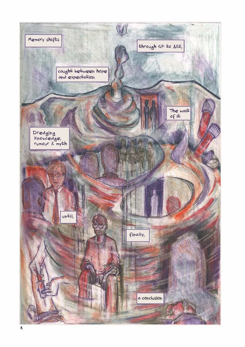
Four of my earliest pages show this. The first two swirl and sweep across the page - all planned over two nine panel layouts [fig.1].
[fig.1] Diabetes: Year One; page 4&5.
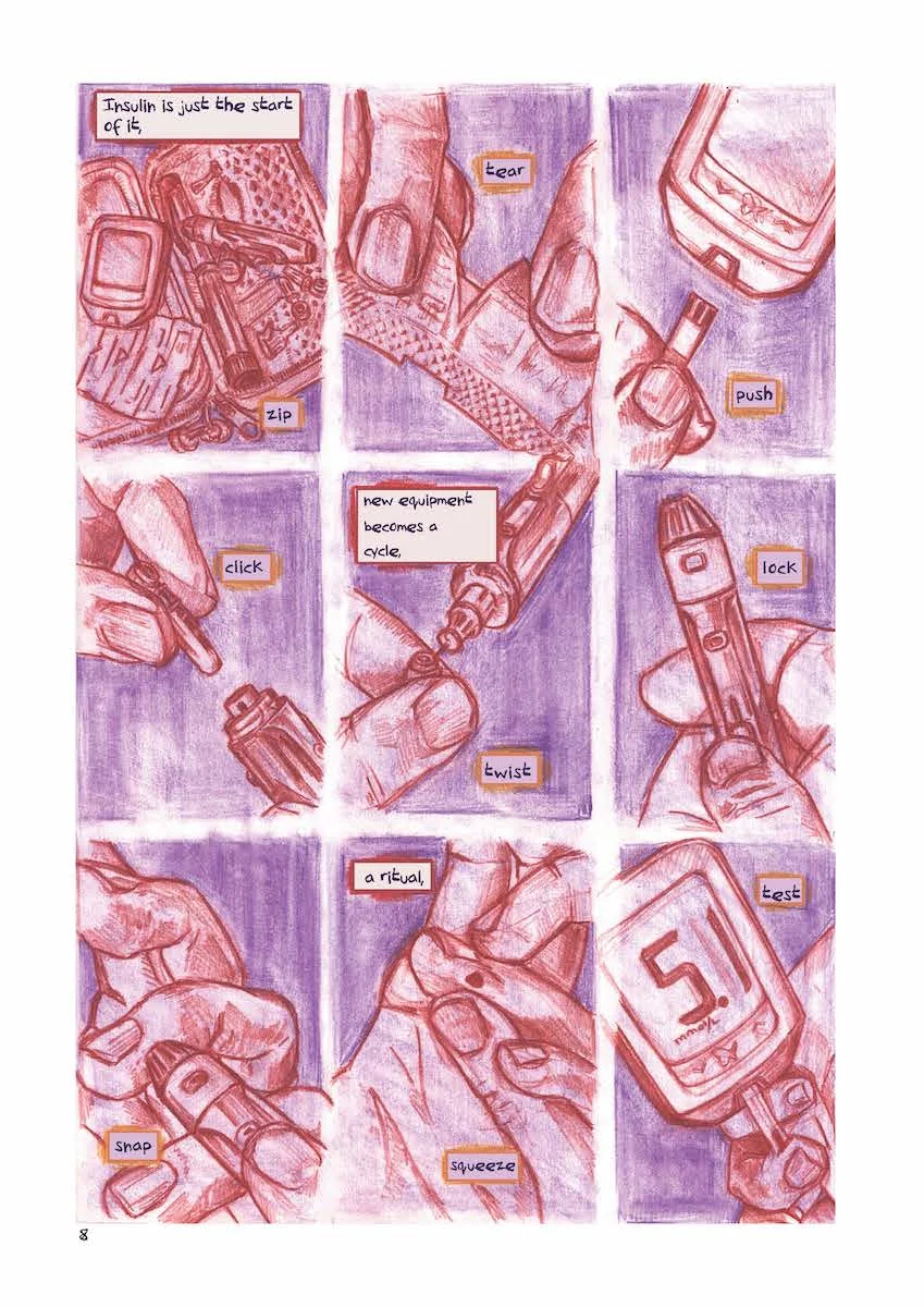
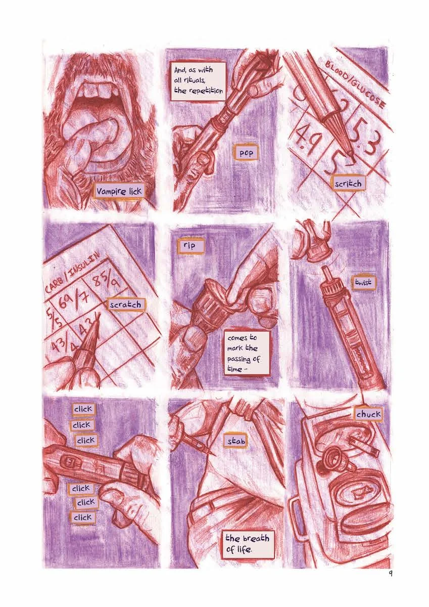
The images break out of the panels, they weave and overlap to convey the disorientation of my diagnosis. The source of the composition is the exploding structure underneath, the foundation crumbling across the pages. As well as disorientating I think the pages show the fragility of these memories - the way that so much happens so quickly that it doesn’t have time to settle, to lie. Instead it remains as echoes, something you feel you should recognise, but can’t quite grasp. Pages 8 and 9 show another approach [fig.2]:
[fig.2] Diabetes: Year One; page 8&9.
Here the panels allow time to focus on each moment, and collectively build up a sense of the impact of each of them. The physical mechanics of the process, along with the repetition of sound try to build up what I think of as the weight of the situation. The way the emotion, philosophy and psychology of being human imbue the physics acts with a significance that is more than the doing of the act.
As I’ve mentioned - the nine panel grid wasn’t the only approach I used - but it got me started and gave me the confidence to explore different approaches. Which I guess, as I’ve rambled on a bit, I’ll cover in another blog.


![[fig.1] Diabetes: Year One; page 4&5.](https://images.squarespace-cdn.com/content/v1/521735b4e4b0563499dc8f68/1549272089740-QMFRU5OZX4Y8ZVWF1L5X/IMG_7248.JPG)

