It’s a strange morning. There is a chill as I take out the bins, but it’s a crispness that cuts through the fog of Monday morning. After the wind of recent days the dark of early morning gives way to the spreading blue sky. As I make my way to the station I am glad I left my big coat in the car that is heading towards my wife’s work, so that my jacket straddles my eternal dilemma between too hot, and everything else.
I’m going to visit my Dad today. He has dementia, and has moved to a care home. By all accounts he’s not doing well at the moment. Though given his situation, that’s pretty relative.
My train is cancelled, though fortunately my travel neurosis means this was an early train just in case. Embracing the ‘in case’ I wander up the platform, and think about light and colour and lines and how drawing me lead to drawing Dad.
I hadn’t anticipated coloured pencils. Pen and ink maybe, painting clean lines with gouache or acrylics, but not coloured pencils. But my line for a long time was better in pencil - it’s more forgiving to indecision, or coffee shakes. My style, when I don’t think so much is quick, instinctive but prone to overworking or overthinking. And when I began Diabetes: Year One that was where my drawing started.
So line lead to pencils (awful pun completely intended), but also to colour, and to the capacity to smudge and rub out. Smudging, blurring, blending were elements I was drawn to for aesthetic, theoretical and very practical reasons. I wanted to convery the complexity of experiences, the way in which each moment comprises different layers of who we perceive ourselves to be be; and I’m left hand and messy, and always bloody smudge the paper somehow, no matter how careful I am to start at the bottom right of the page! So y’know embrace the inevitable.
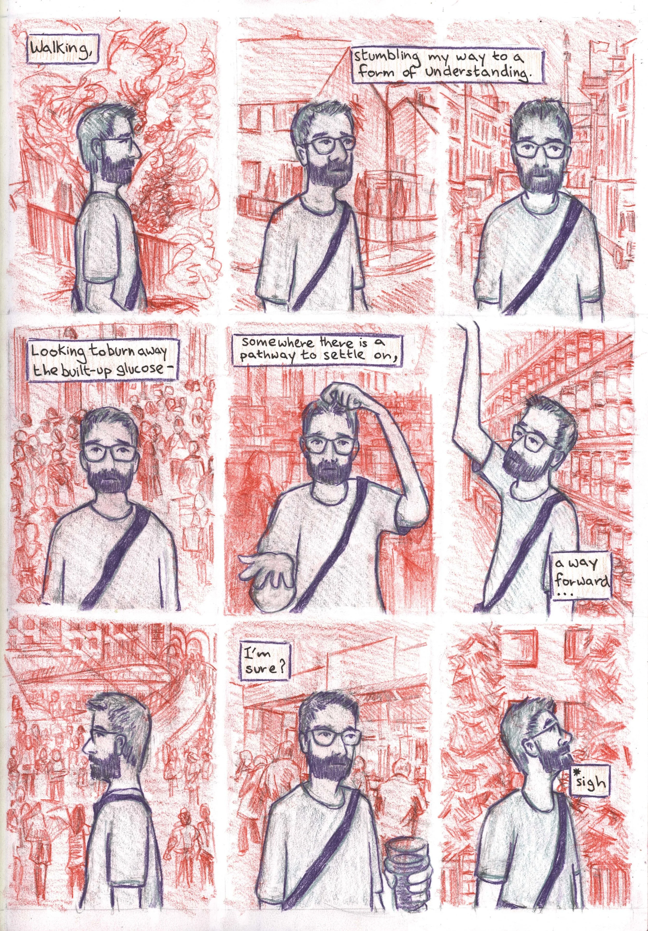
Using colour is difficult for me. I’m aware that I have a bit of a marmite colour sense; that I like colours that don’t always play nicely with each other. Colour pencils let you use tone to play with that; let you rub out layers, and build them up to create depths and ranges of colour. In turn this can create dissonance between the fore and background and between my experience and the world around me [fig.1]
Fig.1: “Diabetes: Year One” page 12 (before someone pointed out to me you could make a font of your handwriting and use a computer to put on/Design the text!)
But it wasn’t just in the book I used this, work on my experience lead to work on patient experience - and what that might mean. This is a part of my work that has grown around sequential art, and through other projects to where it is now. But as the first pages of the comic developed, so did Images of Dad’s dementia. In these images my interest in portraiture, in colour and line and in story telling come together. One image of my father took his own words to create a portrait - which you can see, alongside a later graphic short story about Dad at this link: https://thepolyphony.org/2019/01/31/drawing-dads-dementia/.
The way these experiences impact on each other is often unexpected. Exhibiting my work at the Pathology Museum at St Barts Hospital viewers connected the issues of type 1 Diabetes and dementia in ways I hadn’t, but that opened my eyes to the difficulty that the two together could have. How do you manage a disease that relies on caluculation, timing and repetition, with less and less recall! Another audience member said that in my Dad’s portrait she saw my own response to type 1 Diabetes - through the complexity of the words she saw the attention to detail that I have tried to use to manage my own situation. Something that will probably be the next blog - Diabetes, neurosis and design.
(Oh, for more about my Dad’s story, it’s well worth checking out my brothers series of essays about his relationship with Dad: https://medium.com/@goosefat101/down-to-a-sunless-sea-memories-of-my-dad-d1d2d3a61360)

