Making a Scene...

I’m heading down to Brighton this week for Graphic Medicine 2019 Que[e]rying Graphic Medicine (#GM2019) this week, so today is all about finalising my presentation, and as I’ve just decided to add a sequence for it - mainly that. I figure next week’s post will be all about what happens, and what I get up to, which means today’s post is another chance to reflect on some past work.

fig.1: Sam & Tee

fig.1: Sam & Tee

This time I thought I’d think about figures and faces, characters and relations, so I thought I’d flag up some illustrations I produced as the online identity for The Family Tree - a “magical realist podcast drama about family, belonging, change and identity” created by @jadamthwaite and @goosefat101.

fig.2: Clara & Jackie

fig.2: Clara & Jackie

The illustrations all begin as pencil drawings, with some then augmented in photoshop [fig.1 & 2]. These two images had very specific roles in the development of the series, and were both fun and a challenge, as in order to get them turned around the most efficient way was to combine drawings, but to do so in such a way to keep the feel of the series. This was an opportunity to play with the digitisation of pencil, which happily creates textured effects I like - phew!

fig.3: Nathan

fig.3: Nathan

The show has a sense of intrigue and mystery about it (so worth starting at the beginning if you fancy a listen). These illustration all depict characters (and in some cases actors) from the show in situations from and around the episodes.

fig.4: Ellie

fig.4: Ellie

The creator briefs were fun - at times including show specific stuff that seemed random, until the episode aired, at times suggesting an allusion, or sub-text they’d like me to include, and alongside all that I was free to embellish and add in my own touches (such as the books in fig.6).

fig.5: Violita

fig.5: Violita

All of which meant that composing the image started to feel very much like a photograph - or film scene. Most of the images are square - to fit social media, which is an unusual angle for me, but one that began to open out space around the character, and negotiate new relationships between the character and scene. Often the angle is heightened - whether as a selfie [fig.4] (also why not a square), or an up or down shot [fig.2 & 6]. The sense of mystery comes from these compositions, but is accentuated by the tonal pencil, and the theme of shadow [fig.4 & 5 - but all of ‘em really] or echo that is built up in these images. The effect is to create a noir feeling in (mostly) ordinary spaces. I also like that you feel that, as well as you - the viewer, someone else is watching these scenes - probably just out of the corner of your eye, so you never quite catch them at it.

fig.6: Shahjahn

fig.6: Shahjahn

I really enjoyed the composition and sculpting of these illustrations - building snapshots of these characters lives. The drawings play on my love of drawing people and faces, but ask me to situate them in ways that are meaningful - the backgrounds are never neutral here. And whilst the show isn’t about medicine, which is more my normal manor - its dealing with issues of identity definitely speaks to my work on how we accept, define or resist medicine as part of our own personhood.

Oh, one final thing, the outline on the images gives a sense of sculpted reality - realistic, but also defined. The show’s magic realist tone seeks to do the same, reality with a twist - perhaps - I don’t wanna say too much, but y’know… listen…

http://thefamilytreepodcast.co.uk
https://podcasts.apple.com/gb/podcast/the-family-tree-episode-1-the-mystery/id1113714688?i=1000375761351

(P.S. - I hope these link works, I tried to embed ‘em - if not, that is the website, so do the cut and past, or manual, thing - ta)
Places and spaces.

Places and spaces. The world we exist in, and the way in which we experience that world. One of the first things I did when I began my practice consciously was to start sketching the world around me. To find buildings and places that I could really look at - to break into shapes, lines, tones and colours, to understand them better, to make them into spaces.

fig.1: The Wasteland [pencil on paper]

fig.1: The Wasteland [pencil on paper]

This started as a sketching project, but has increasingly become a dialogue with my drawing. The one looser and energetic, the other formalised and tonal. But the sketching has made me embrace idiosyncrasy and love movement, whilst the drawing has prompted clarity of vision, so that there is more economy of line, and thought in composition. One result of this has been more forgiveness of the wobbly line - a tendency of mine from teenage has been the pursuit of the perfect swish and swoop, or worst, a straight line.

fig.2: YHA Boggle Hole [ink on paper]

fig.2: YHA Boggle Hole [ink on paper]

The images today represent many of these features in various media - I have two considered drawings that evoke a setting. The Wasteland [fig.1] is a pencil study for a possible setting, playing with depth and detail, evoking a place in time - a space for characters to inhabit, and the emotional response, the tone, of that space. Whilst YHA Boggle Hole [fig.2] was a commission of a place as a present, a process that involves considering presenting that place, and making it a space as object. Drawn in ink, with a dipping pen I was able to create a degree of texture in building up layers of shading, but I also wanted to use this idea of place presented, to use and disrupt perspective and framing as a part of the conversation.

fig.4: Kendal Castle [pen on paper]

fig.4: Kendal Castle [pen on paper]

fig.3: Shaftesbury Theatre [pen on paper]

fig.3: Shaftesbury Theatre [pen on paper]

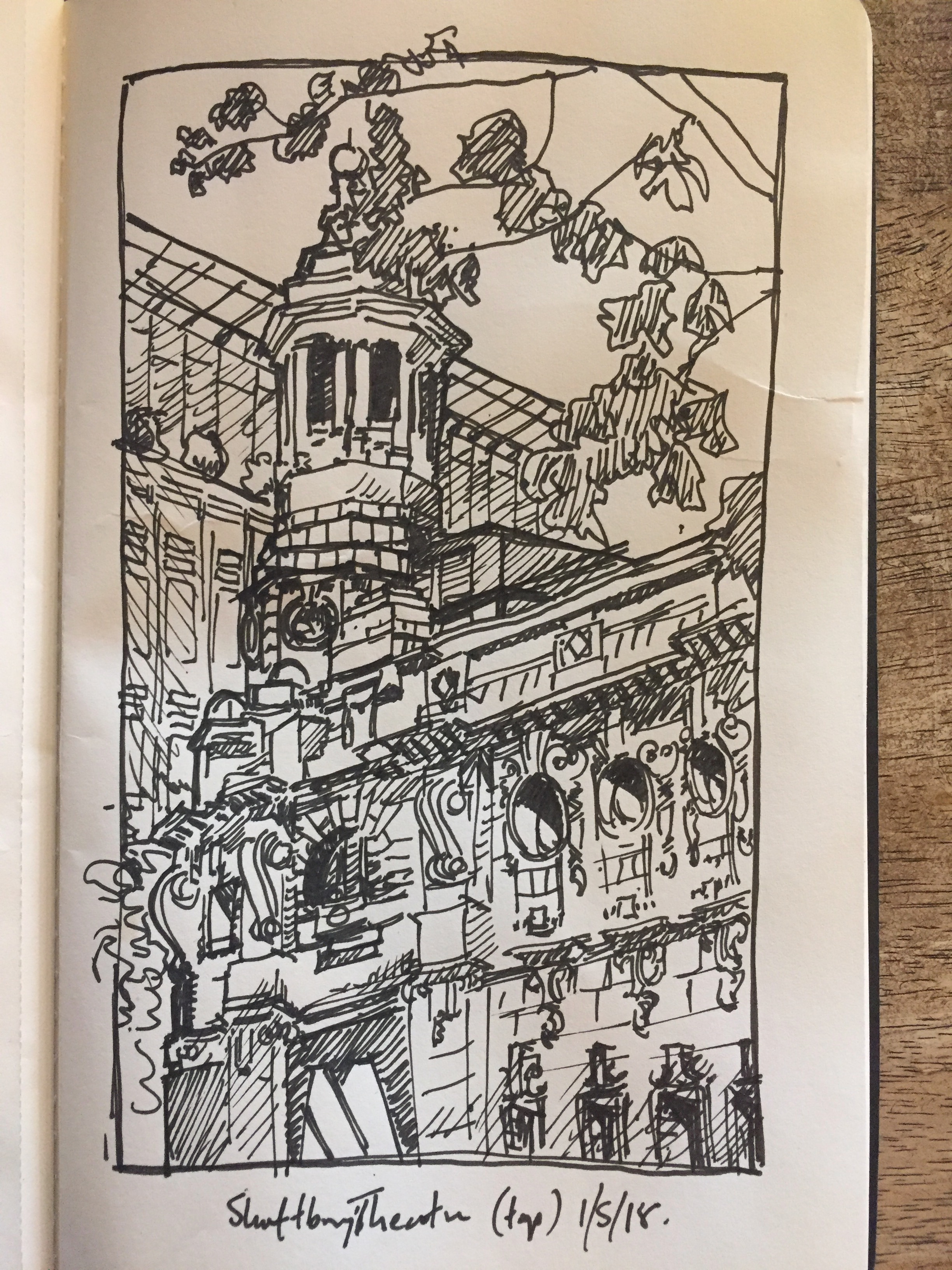
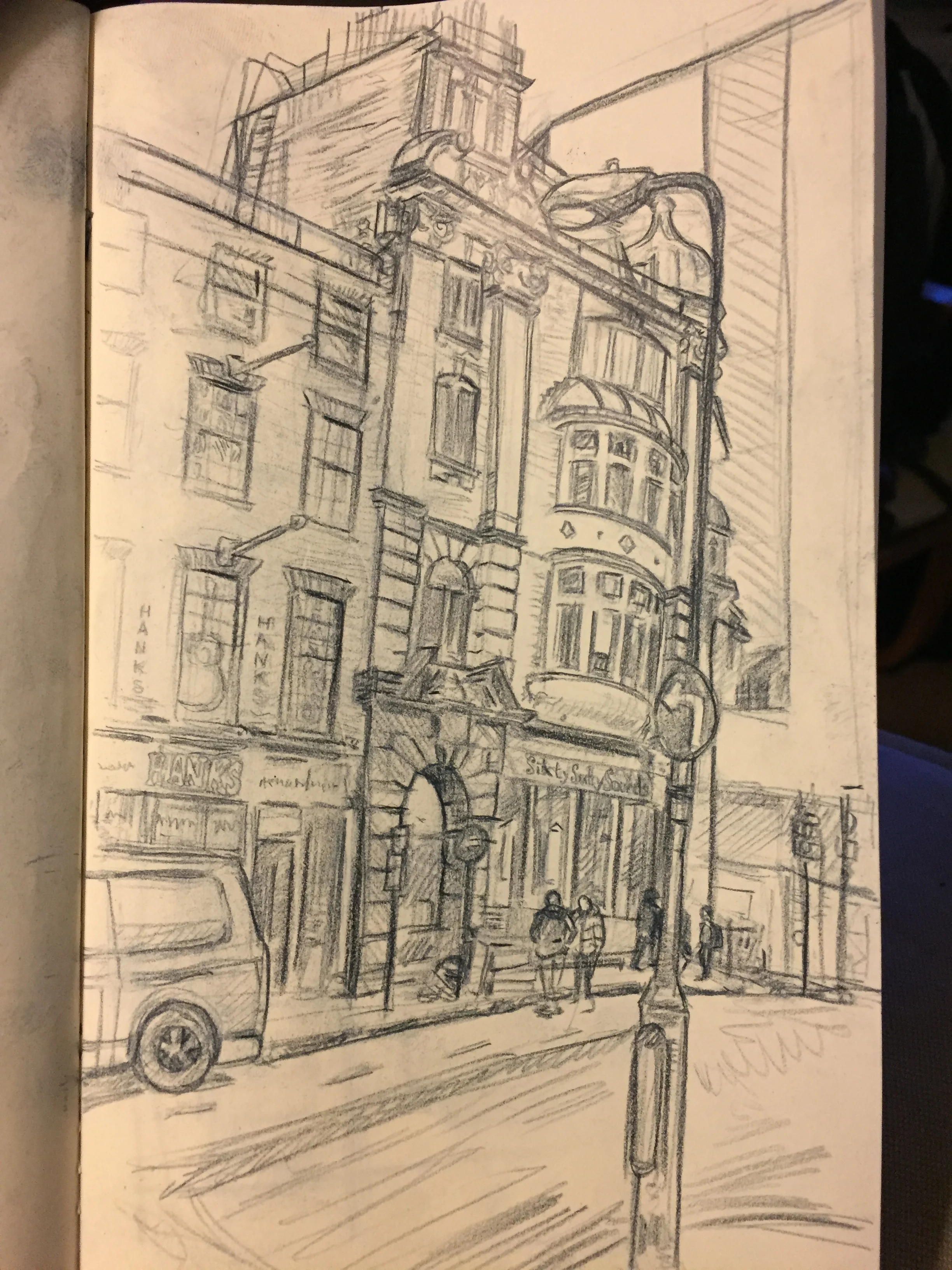
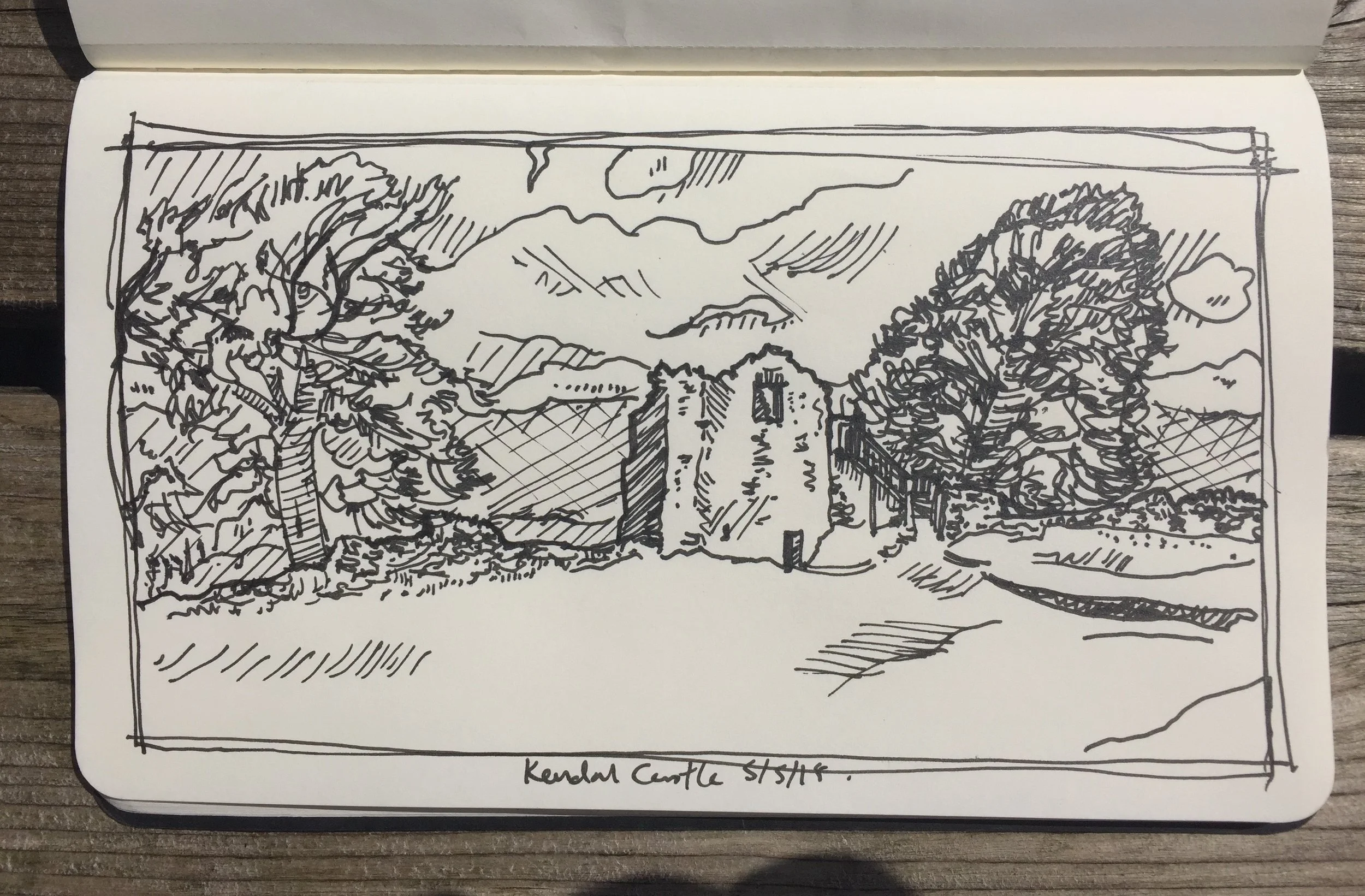
The others are sketches - of buildings and landscape. The buildings are sketched whilst drinking coffee, the landscape whilst taking a break from talking. Shaftesbury Theatre [fig.3] and Kendal Castle [fig.4] are pen sketches. I find using a thicker pen gives less allowance for fiddly detail, which in turn means you have to breath before making marks, to give yourself time to see where the pen will go, rather than my normal approach, which is to get marks on the paper and tame them to what I want. This was a choice that came from drawing, where I could take the time to refine line direction and thickness. You can see this approach more in the pencil drawing of Sixty-Sixty Sounds in Denmark Street [fig.5]. It’s not the best photo, but you can see how the think-as-you-draw nature of my mark making is refined to bring edges to a line, and to build up the tonal range.

fig.5: Sixty-Sixty Sounds [blue pencil on paper]

fig.5: Sixty-Sixty Sounds [blue pencil on paper]

I like both approaches, but there’s something rewarding about the pen sketches purely because it’s so much easier to overwork them. Pencil is seductive, and I could easily spend the day in a sketch that becomes a drawing, so in some ways I never feel finished (though, of course, I have to); whilst with pen your time and paper is finite, so the experience (and this might be a lot to do with sketching from coffee shops) is more of a rush - clear observation, decisive lines, and the capacity to adapt to mistakes, or to quickly abandon it and start again.

fig.6: Spring Cottage [pen on paper]

fig.6: Spring Cottage [pen on paper]

I have talked before about drawing as a way to respond to the world - hinting at its meditative qualities, and about the ‘mindfulness’ of focus - the close observation of the immediate and the ‘now’. In many ways this idea of space-making in drawing (or in art and design in general) is about the reflection on relationships that exist within and around places, that define space.

Earlier I mentioned that my practice was part of a dialogue, so I think that my last image should be a sketch that is a conversation - a way of communicating with my father who has dementia, who likes to watch me sketch - an act that is present, that is connected to the place around him, that may help to give it meaning (albeit briefly), that creates a space. It’s unfinished - next time I’ll make sure to take a cushion out for Dad, but after the first few lines, as I could relax into the perspective and proportion of the building, I could look and watch as his eyes followed my hand, measuring watch I was producing on the paper against watch he could see in front of him. As it happens, I think this drawing balances on the fault-line between the styles I’ve discussed today...

This was supposed to be another quick post - though I seem to have got carried away… maybe it’s the yoga? - but that’s for another post…

I'm laughing, you're laughing?... I'm... oh...

It’s Monday, and the last of the solstice light comes crashing through the window, as work looms up to mock my bleary eyes.

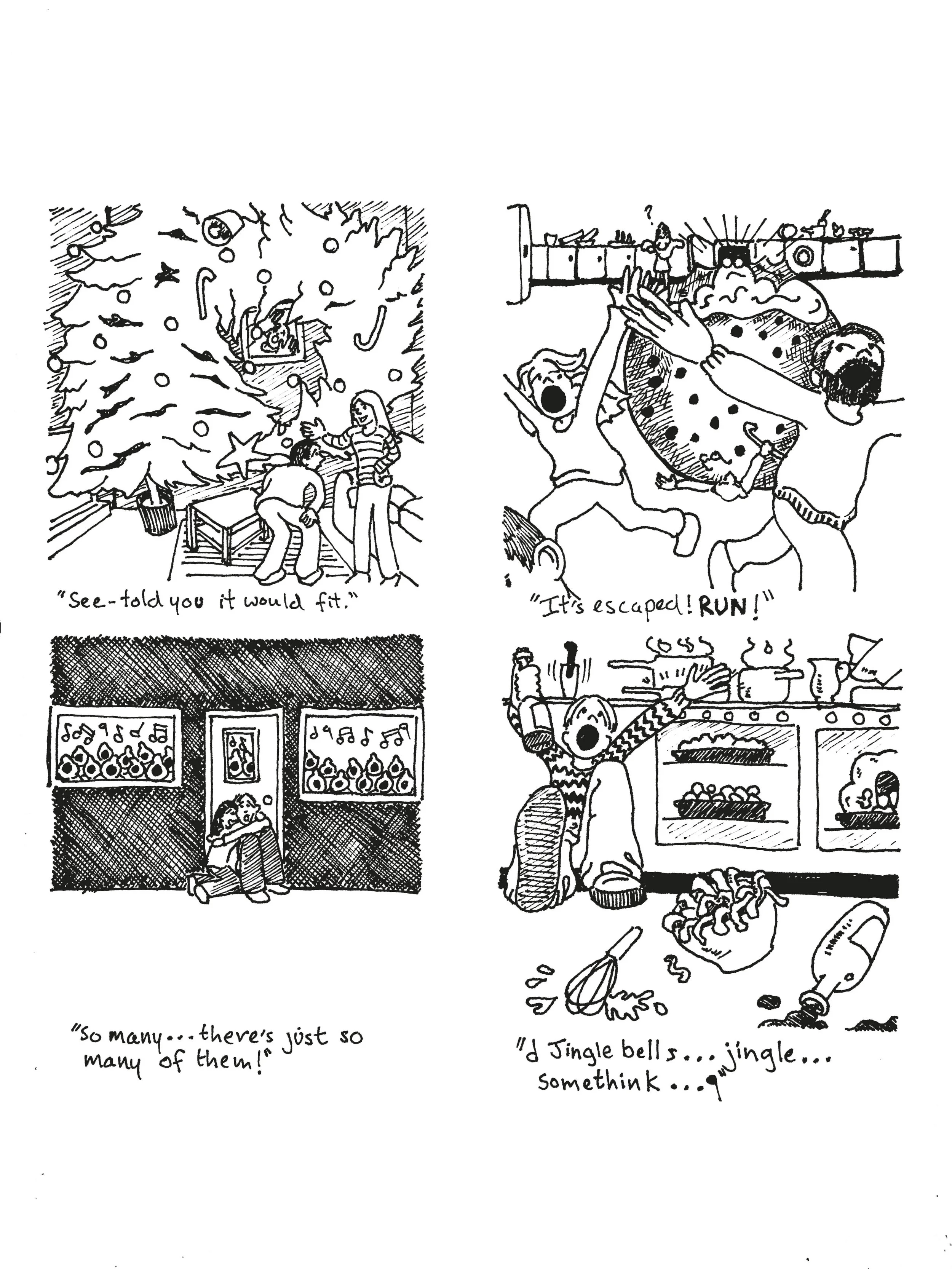
I’m determined not to be so tardy this week, so this post is a few pieces from my random art file. The pieces are ink based, and focused on my sense of humour - dark [fig.1] and slapstick [fig.2, 3 & 4] (and arguably not that funny - although I’m laughing).

fig.1 Trick or Treat (Inktober 2018)

fig.1 Trick or Treat (Inktober 2018)

This sequence was inspired by last years Inktober prompts, which I was running late on - but fortunately seemed to naturally fall into a suitably gruesome narrative. It gave me a chance to develop characters, but also to go heavy with the ink for a Noir feel. I like the detail in the style, the use of perspective, the dancing of the story, and the twist in the last panel. And the gunk… I like the gunk.

fig.2 Madcap DayOut

fig.2 Madcap DayOut

This image was an unused idea for a commissioned piece - aiming for more family friendly in audience. I still wanted to add a sense of the chaos I remember from family days out, and the sheer effort of the experience I have since encountered looking after nieces and nephews. Again I like the energy and movement, as well as the conflicting experiences of all involved. As befits the ‘zany' approach the final version was coloured an tweaked using photoshop (see bel… erm, here…

fig.3 Madcap Day Out (colour version)

fig.3 Madcap Day Out (colour version)

The disconnected shadow does add energy (and the dad’s shoe is uncoloured, as it was behind an object - (honest!).

I find humour is a great way to explore ideas and thoughts visually - it gives you the space to both articulate, and critique your thoughts, and hopefully find ways to connect ideas, feelings and experiences in a way that makes them accessible in real life. Saying that I’m not sure what ‘Trick or Treat’ says for my relationship with pumpkins? And humour can also feel very vulnerable - after all, the image can be great, but if it’s not funny… well, that’s it.

Still - I must have a big enough ego, as this next lot [fig.4] were my xmas cards last year, and while I’d refine the line a bit (it was a last minute ideas, so I ran up against the print deadline), the main thing was would the idea work? I especially like the carol singers - the image is economical, and the caption tells a strong story; though the tree and drunk-in-the-kitchen relate to my experiences of Christmas. The feedback was good thought, so this year… hmmmm.

fig.4 Xmas Chaos

fig.4 Xmas Chaos

Again, gotta rush. Next week I suspect will be also rushed (hopefully then back to normal), so I’m going to focus on places and spaces I’ve explored in drawings before.

Work in progress...

It’s been hectic so far this week, so a very quick, and late post this week, and not much commentary I’m afraid, but i didn’t want to miss a post… so *coughs*, here it is.

fig.1 “Mental Health/Escher” WIP

fig.1 “Mental Health/Escher” WIP

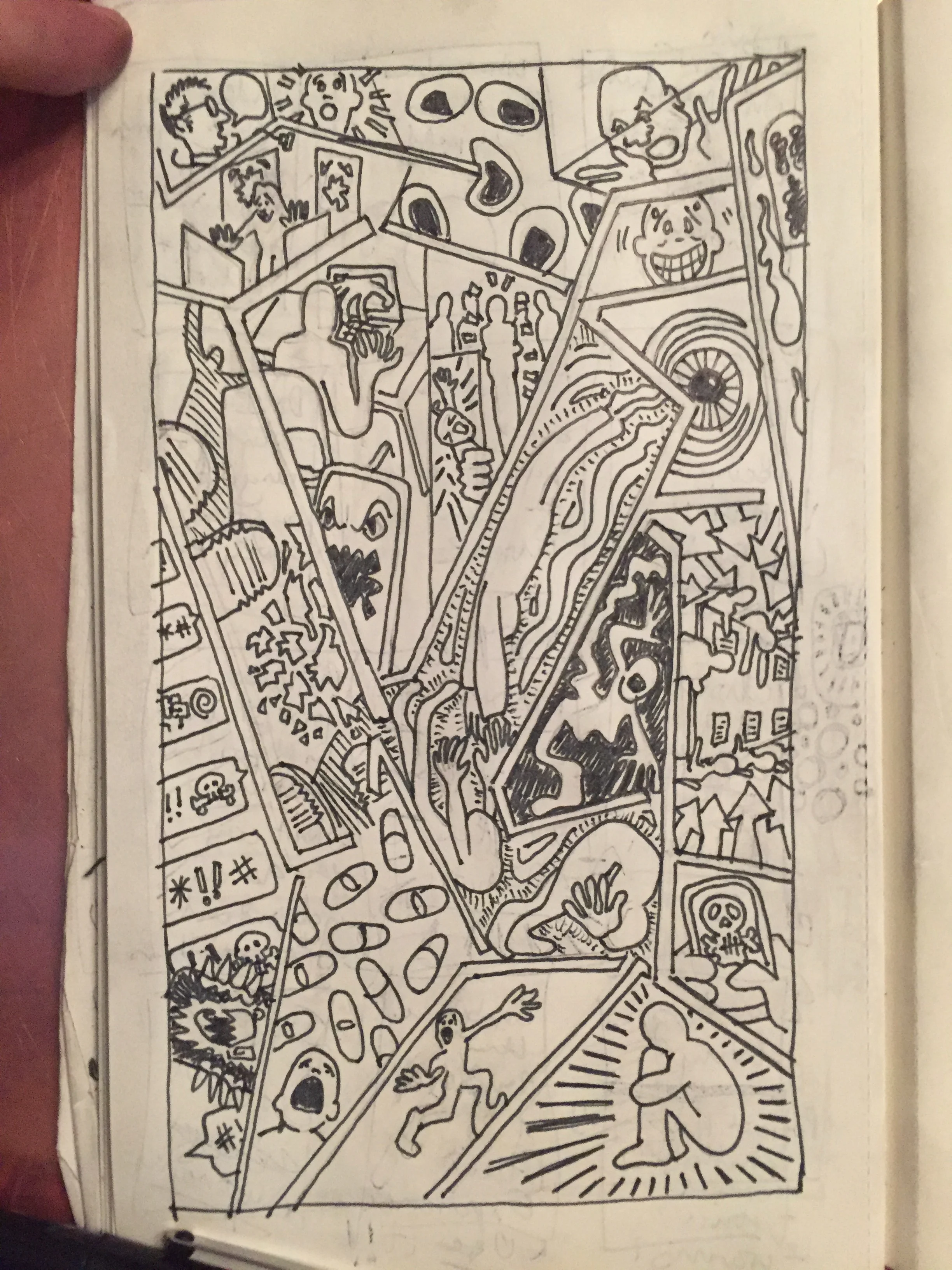
Grabbing some moments for my work has seen me messing around with the disorientation of 3D to explore my mental health/Escher sequence that I’ve been developing [fig.1]. This needs some clean up, and refinement - the balance isn’t right yet, but it’s now got me thinking that I might produce this as a series of print versions - and that 3D has definite possibilities. My normal process involves working quickly on instinct - partly to bypass overthinking, but, with this image, there’s scope for exploration and investigation, which I want to enjoy.

Otherwise I had a chance to visit my Dad in his care home. Because of his dementia sketching has become a part of our communication with each other, filling in the blanks in memory and conversation [fig.2]. He enjoys watching me sketch as much as the finished product. This time we were able to spend some time watching adult Blue Tits bringing food to their young. I didn’t catch the birds, but the trees and the boxes led to a sprawling and expressive sketch that seems to exist between my more controlled drawings and my scribbly sketches from life…

IMG_8099.jpg

The posts for the next few weeks might also be image based, but I suspect it will all lead to reflection in time ;)… Right, that’s my snap-shot of my thought/work process this week - now, have to dash.

Disrupting the norm.

So it’s been one of those weeks – where work and jobs and family stuff has been manic. And, alas, not all of this has been creative! Naturally, as I write this it’s a glorious morning, which is both uplifting – B12, vitamin D, dopamine, all that stuff; but also makes getting my head down more difficult – fortunately I have this blog, so I give myself permission to spend some time reflecting… *ahem. 

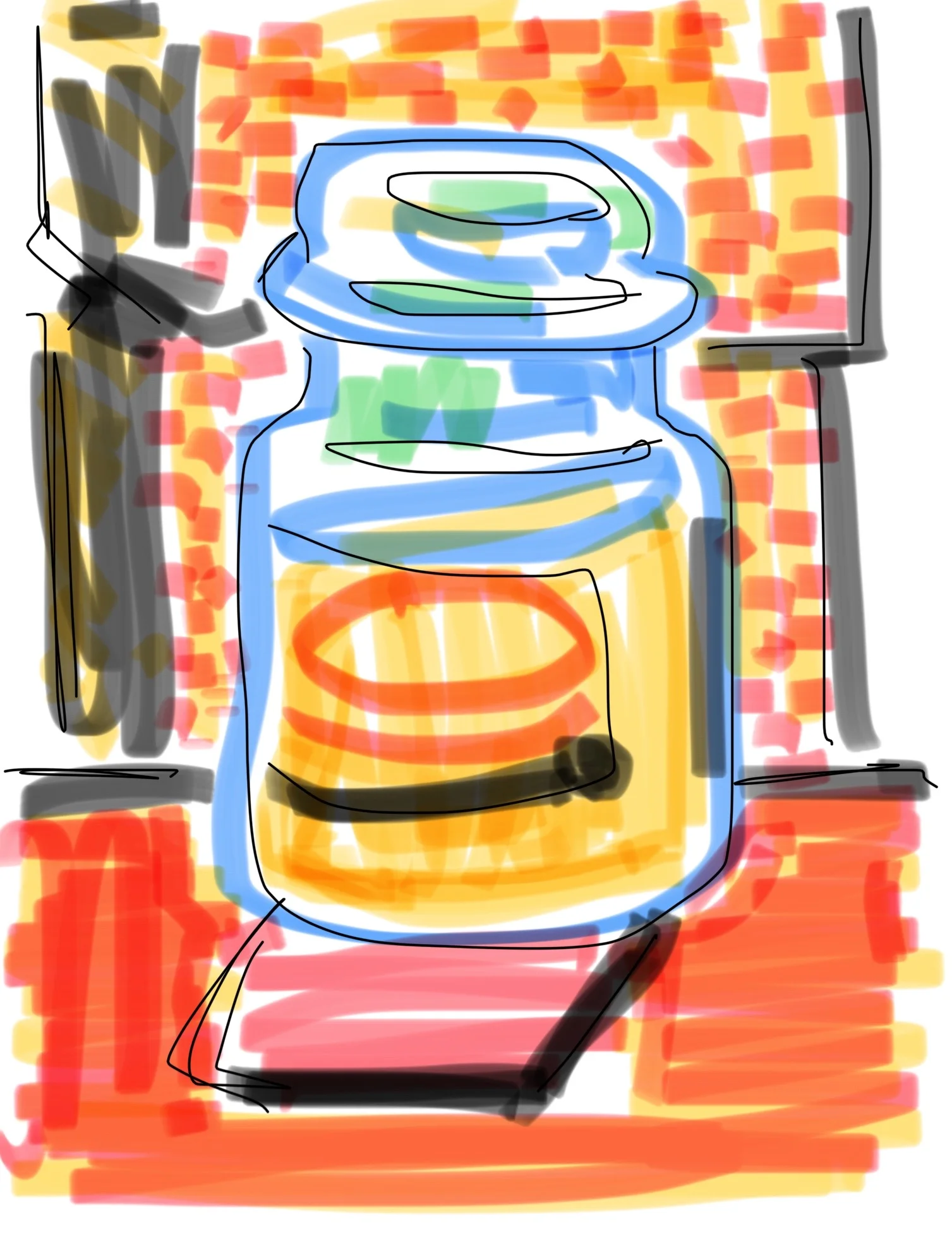
fig.1: Talisker 10 still life

fig.1: Talisker 10 still life

While all the stuff has been going on I’ve been chipping away at my Escher/mental health piece, and I aim to deliver a post on its completion next week; but having less time means I’ve had to try and find ways to fit in my practice where I can. 

fig.2: Commuters

fig.2: Commuters

So, faced with crowded trains, access to only a phone, and the positive impact of disrupting your practice, I’ve been messing about with my phone, my finger, and the capacity to draw using the Notes app [fig 1-4] (My phone’s memory is stuffed, adding in other better apps is not really an option till I upgrade). This is not quite Hockney and his i-pad, but y’know, thought I’d give it a go.

fig 3: Candle Jar still life

fig 3: Candle Jar still life

It’s made me think. The results have been interesting – challenging me to consider composition, economy of line, new ways of using colour, and accepting a looser approach – my finger is just not as precise as a pen would be! The colour in notes is through highlighters – so you can blend-ish, but it’s tricky – kind of a mix between a marker and watercolour. The upshot is it makes me think about colour as absence, blocks and pattern, and I use black for tonal variations – I usually keep black away from colours!

fig.4: Commuter - man on train

fig.4: Commuter - man on train

Drawing like this opens up new approaches to figures – considering how they take up space, and present attitude; and for the still-lives, how the objects relate to their surrounds in what is a pretty bland room. I can’t cut through the image or erase mistakes in the same way, so often the choice is between accepting a mistake or starting again; a constraint that makes you look that much harder. The results are rougher of course, but there is an energy as a result, and I wonder…

I come to these qualities with fresh eyes, because the medium is not familiar. I will continue, and get the jobs done, I will complete the Escher piece – I’m still very excited by it! But I will also try to build on these experiments – considering these images and how the approach will work for me.

A testing time.

A new week begins, oblivious to the shooting stars of work, things to do, quick jobs and a myriad of deadlines that arise, approach and depart. In amongst all this I’m working on my Escher piece on mental health [fig.1]. 

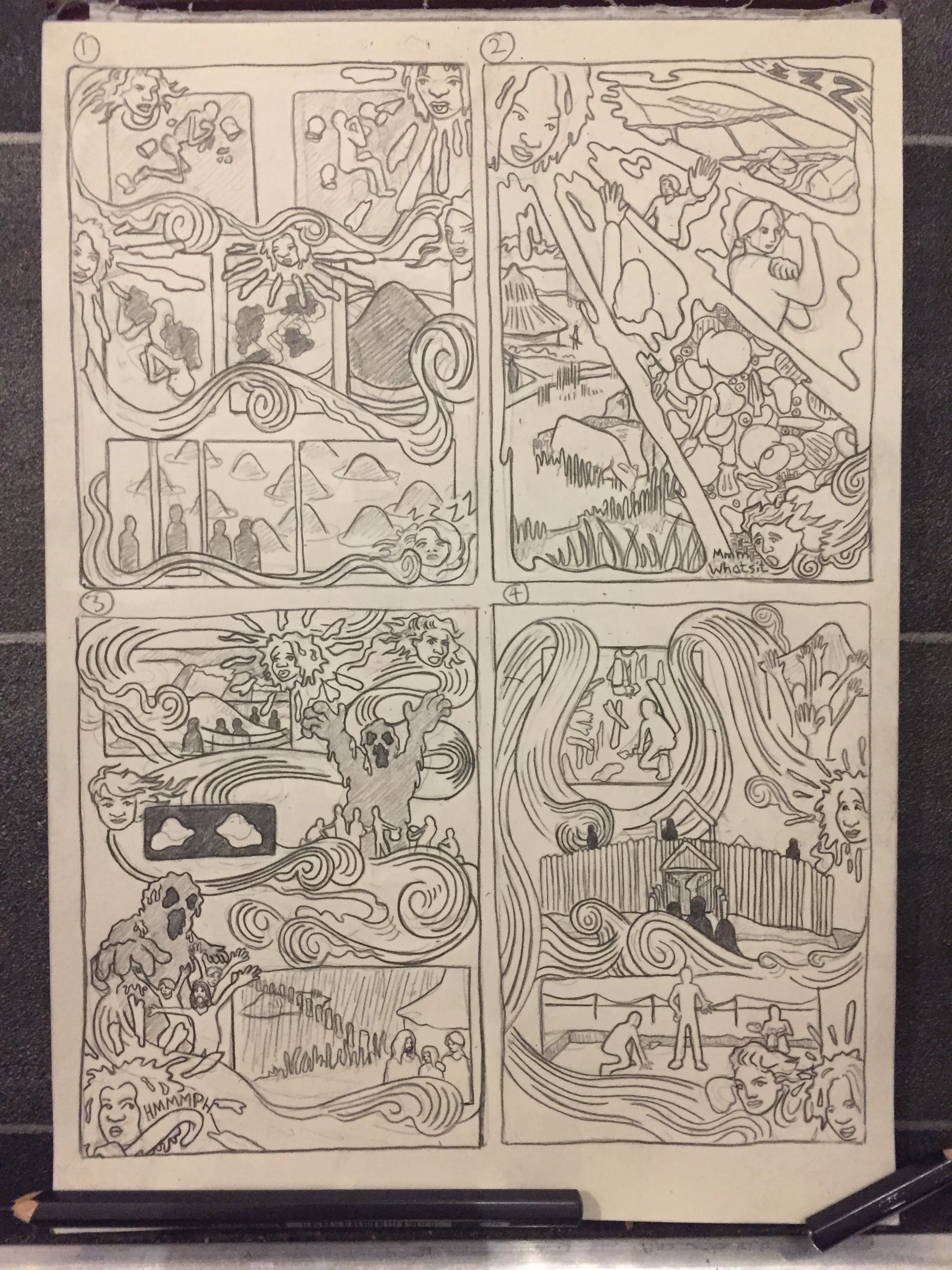
fig.1 Development drawing

fig.1 Development drawing

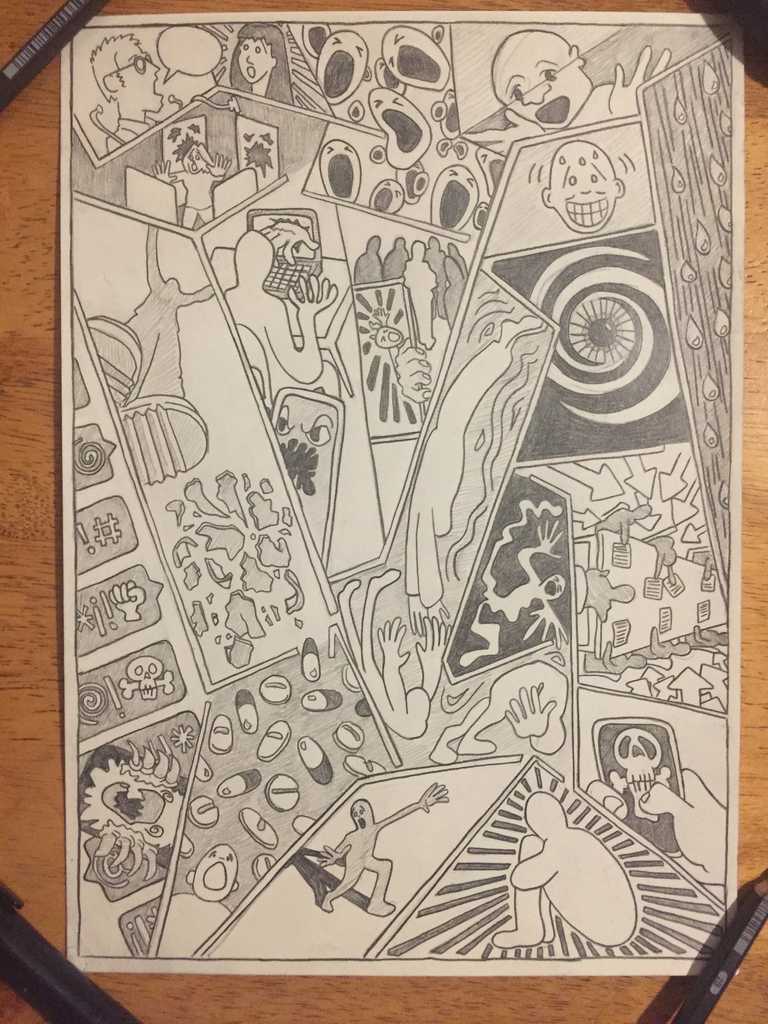
 Last post I discussed the initial sketch and the generation of the concept – now it is time for shaping it. The idea moves from a sketch to a more detailed drawing, a chance to re-interrogate the ideas, to see if they still work, and to test the logic of each panel. The first step is to translate the shape of the drawing – my sketch book is long and thin, so tends to squish ideas. A new drawing gives me the opportunity to explore more width, to see which panels need more space, and which benefit from the elongation to work. 

 The quality of line and shape is more carefully described on a larger scale – navigating swirling movement and lines of perspective. In adding in or removing moments of detail quirks are made permanent and weight and impetus is given to scenes – monsters realised, psychology intensified. Panels are tweaked, and in places, where I can no longer see my thinking (or disagree with it), completely changed. 

 Through this process I find myself becoming obsessed with the movement of the pencil. From the initial flicks and swirls of the compositional marks, through to the pressure of the final sweep. There is a tension between the need to embed my intention in the line – for clarity, and the need to remain relaxed enough to describe the languid sweeps and curls; a tension between the need for confidence in the making of the mark, and the fear of slipping. As a result, in my drawing I think there is both a façade of bravado, and an ability to embrace – and sometimes revel in, mistakes, wobbles – elements that disrupt concepts and intentions. 

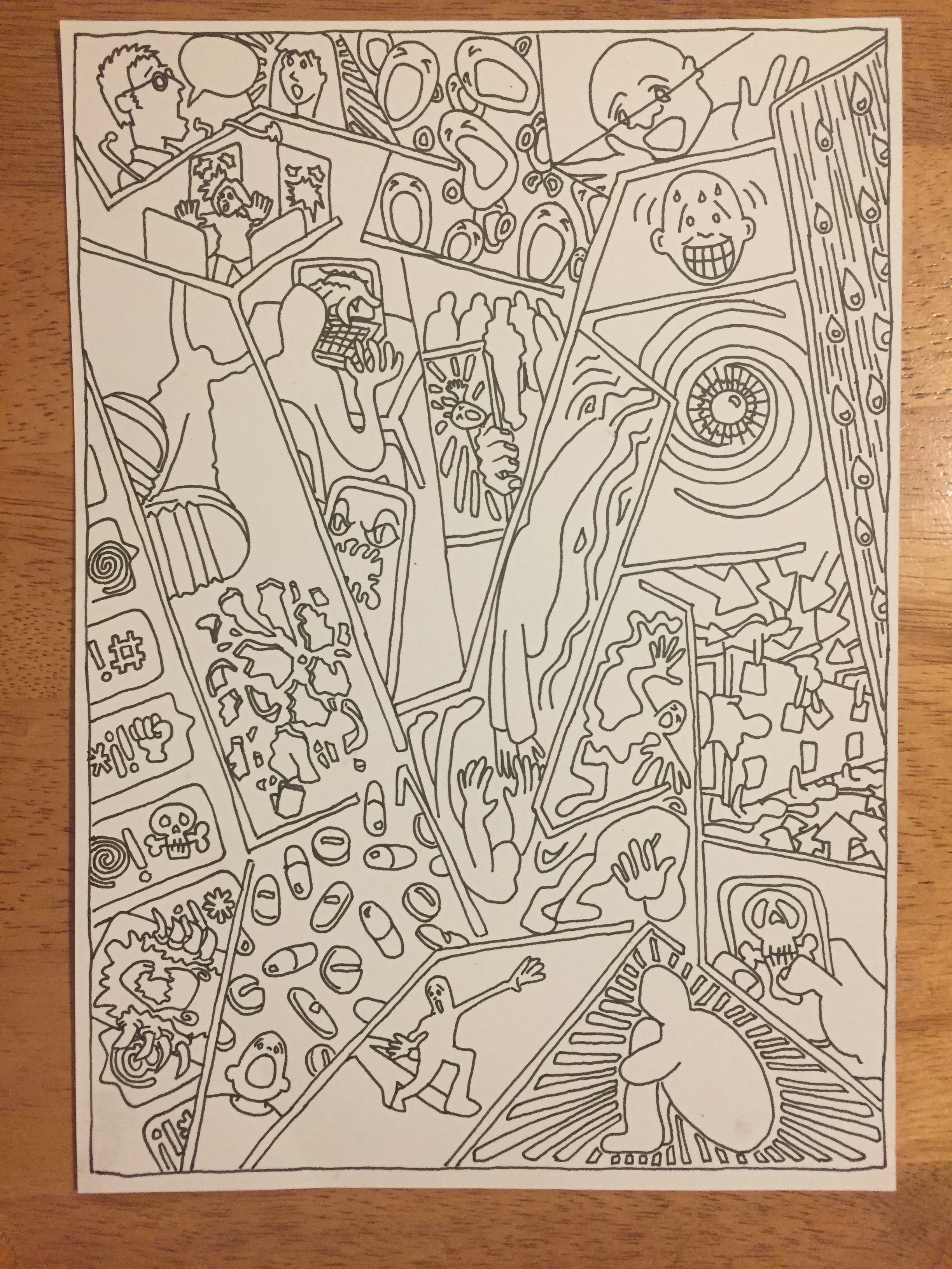
fig.2 Line ink

fig.2 Line ink

 The final aspect of the drawing is to suggest areas of tone and contrast. I do this even though the next step is to ink in the line [fig.2], knowing that when I scan in the ink drawing I will colour using this tonal plate to guide the colour palate. Adding tone gives me the opportunity to consider how the picture plane will be broken up, and how the eye will move across the panels, and so how the eye will read, or be guided to read the sequence. In this case the, although the sequence will not read in a linear manner, the reader will begin in the western comics tradition – providing the opportunity to use depth and a moving horizon to distract and disorientate, and to sculpt a new way of experiencing the narrative. 

 Which, given the topic of mental health, and how it is perceived and experienced , is kind of why I started this in the first place.

Mental gymnastics.

Shrieks of seagulls, and the rumbling of the tide greets me as I wake this morning.

Outside the sea is calm, rippling to the horizon, broken by the jutting seawalls and the odd boat bobbing into view. Clouds sweep across the panorama – skipping through shades of grey to meet the clear sky in the distance.

A quick seaside break over the bank holiday brings these new sights and sounds as a stimulus to recharge and rethink, and I am reminded how travel provides the chance for me to reflect on my work, but more importantly gives me the impetus to imagine ideas.

fig.1 mental health

fig.1 mental health

fig.2 Shaftesbury Theatre

fig.2 Shaftesbury Theatre

fig.3 Denmark Street

fig.3 Denmark Street

 I want to think about a piece in progress for this blog [fig.1], one that began on a trip, in a quiet moment between travelling from and to, whist going to speak about Diabetes: Year One as a way of enabling patients through art. I like to arrive early if I can – to give myself time to wonder around a different space, often to sketch places to try and understand them better [fig.2,3 & 4].

fig.4 Kendal Castle

fig.4 Kendal Castle

These quiet moments are often the best time to lose yourself in an idea that’s been at the periphery of thought for a while.

This sketch takes the idea of M.C. Escher’s Stairs and uses its play of perspective as a structure for a panel layout. The shifting plains demand a disruption to narrative which has intrigued me for a while; an approach that attempts to describe the layers and shifts of thinking that exist around mental health - and as it was mental health week when I was sketching, the topic seemed apt.

In terms of process this is the beginning - the sketch needs work, I will have to tweak line, and clarify certain panels, challenge some of my decisions and reflect on how to be, colour and shadow will interact - if at all. But at this stage it is about identifying the structure, creating the handholds of narrrative and just dealing with the maths of perspective and the imagination of scene. This to me is the grunt work, a process of drawing and re-drawing to fit the image in my mind - testing my imagination as object and establishing the relationships of logic or aesthetics as ideas start to meld.

Having just finished a project it’s nice to work on a personal piece - a mini project, where there is no one to blame but myself for the constriaints I have placed. It’s nice to get back to my own masoschism for a while.

Past-Masters

fig.1: Iron Age p.3

fig.1: Iron Age p.3

Another week rolls around, and, for me, this week is about bringing long running projects to a close. This week I’m all about pencils – lead and colour, as I finish a series called Pre-History to Primary Schools for the Archaeology department at The University of Manchester (Specifically: Dr Nick Overton, Dr John Piprani and Dr Hannah Cobb) [fig.1]. These comics have sought to translate and imagine the department’s research, so that it can capture the imagination and contextualise the technology and anthropology of Pre-History.

The project has been collaborative, with the department gathering research, and establishing the key technological or societal factors for each era, then developing scenarios around which to display the finds, digs and things that provide the basis for our thinking about these societies; before turning it over to me to create a narrative script and to illustrate the comics. It is part of my role to balance information in narrative text, with information shown through the flow of images. Alongside the information booklet, and the comics, objects are provided to create a package that is interactive in different ways – designed to inform and represent research, but also to engage imaginations to ask more questions, and to become curious.

fig.2: Neolithic p.4

fig.2: Neolithic p.4

 For me the challenge has been a deliberate decision to tell these stories of a society influenced by the agency of things. The narrative point of view is very much part of this society – but not necessarily human… or animal. This point of view has informed the design of panel and gutter to provide a sideways approach to the story that unfolds. Finding a visual language for this research has been ongoing – but from the start has been driven by a sense of lyricism, and a quirky perspective that is both part of society, and outside [fig.2]. Much of the collaboration has been to negotiate my instinct towards elaboration with the need to represent the accuracy of the latest thinking – to visualise the skeletons in the flesh. The result is that the strips are grounded in naturalism but seek to consider the idea of the agency of thing, flora and fauna through moments outside the specific, and a use of colour that seeks to wink at our modern empirical view of the world. 

fig.3: Mesolithic p.1

fig.3: Mesolithic p.1

 As the project has developed I have evolved my process – always beginning with thumbnails, but increasingly moving to a pencil, then colour model – rather than working over the pencil drawings. With each era the images have mixed research into finds and objects, the presence of defined landscapes, hints of film allusion, with the graphic potential of comics grammar. These developments have allowed more discussion of changes, and less fear about suggesting ideas (as changes are easier), which means that the discussion becomes creative and better solutions are found. Discussions around the theme of death [fig3], the representation of gender and race, about dispelling the norms of contemporary society, and balancing the thing and the story. And, as this next week begins, it is my move in the discussion, to create my pencil templates that realise the changes suggested to the thumbnails [fig.4]… but also find a way to communicate the narrative drive ;)

fig.4: Bronze Age: initial thumbnails

fig.4: Bronze Age: initial thumbnails

Internal, external, enabling me?

So the sun’s out, shorts have been gathered up from the depth of my wardrobe, and warnings about possible skinny leg sightings posted in the neighbourhood.

With new weather comes new perspectives - I mean generally, not all the time, but… often. It’s a slightly different post this week - really I’m going to let the images do the talking. I’m planning at talk entitled "Enabling Patients Through Art” at a conference called Patient, Heal Thyself (see more at www.euhic.com (ugh, link won’t embed, so copy n paste), and promo artwork [fig.1]), which will reflect on some of the concerns I’ve blogged about regarding my work and it’s relationship with type 1 Diabetes. The promo itself explodes some of my thinking about the role of the patient in relationship to healthcare provision, and to the experience of becoming first a patient, and then a person living with diabetes.

Fig.1: Patient Heal Thyself

Fig.1: Patient Heal Thyself

And, naturally ,whilst planning out a talk, and thinking about the blog for this week - I decided to draw a cartoon reflecting on some recent experience (unsurprisingly food based, though more surprisingly picking a fight with Isambard Kingdom Brunel - go figure!). In doing so I find I reveal my thinking to myself, and in this case it enables me to step back, to give myself some perspective, and even to find humour in the realisation of my own melodrama [fig.2].

fig.2: ‘You think that was tough!’

fig.2: ‘You think that was tough!’

Whether this is enabling, or coping, and what the difference is between the two; and why comics, and cartoons seem to be such a useful conduit for this thinking is something I want to explore, and *ahem, need to get on with...

[Exit pursue by a bear, erm, work]

Reflect and refresh.

It’s Friday, and you know the Week should be winding down; but new deadlines have managed to creep ominously forward, whilst others you thought you’d disposed are rearing their heads with ‘just one more thing’. You find yourself looking at the weekend trying to work out where you can fit in a bit of work to try and sneak back some of the time that is currently slipping through your hands. Your mind is popping with the logistics of zig-zagging family and work, and your energy is focused on finding the time - but not on what it is you have to do.

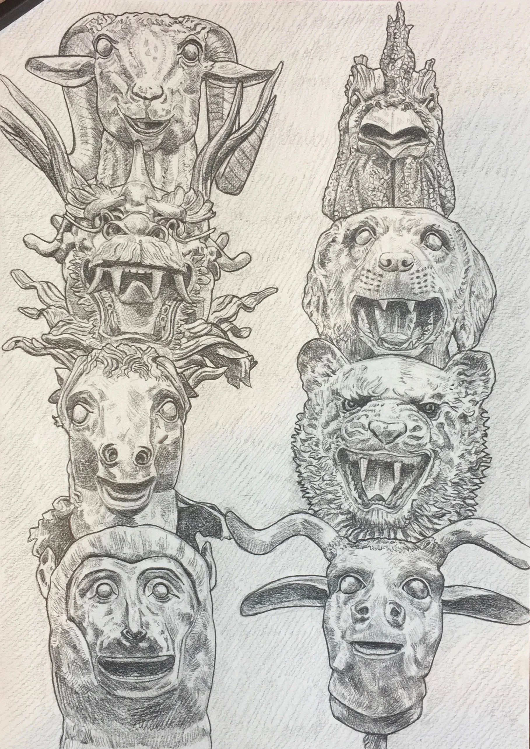
So, as I felt a familiar twitch of the eye and the bitter taste of adrenaline, I was lucky that I’d already agreed to spend a day getting drunk, and another going to the Yorkshire Sculpture Park this weekend. Having no choice meant that I had to refresh rather than stress. A day to let go, and another to revive my eye, and my mind (and a bonus day to obsess) enabled me to reflect on the projects, to explore more fruitful ideas and choices. Specifically sculpture often inspires me to sketch in detail, and in this case it was a drawing inspired by some of Ai WeiWei’s Sculpture of the Chinese Zodiac, which I’ve subsequently played with digitally [fig.1 and 2], and want to think about a bit here.

Fig.1 ‘Chinese Zodiac: Studies (digital edit)’ Original Sculptures by Ai Wei Wei at Yorkshire Sculpture Park

Fig.1 ‘Chinese Zodiac: Studies (digital edit)’ Original Sculptures by Ai Wei Wei at Yorkshire Sculpture Park

Fig.2 ‘Chinese Zodiac: Studies’ Original Sculptures by Ai Wei Wei at Yorkshire Sculpture Park

Fig.2 ‘Chinese Zodiac: Studies’ Original Sculptures by Ai Wei Wei at Yorkshire Sculpture Park

I am fascinated by the drama of gesture, shade and dimension, but can only really process all this by working it through in tone and shade. Drawing involves making judgements about distance and placement. Doing this reminds me about the rules and potential of composition, and also, as I inevitably find that I have made a mark that is errant, of the hubris of picking up a pencil. Realising your fallibility is useful, as is the realisation that sometimes the mistake is more interesting that the ideal. The process asks me to reflect on my choices, to defend my decisions, but in a situation of my own making, where I can feel free to fail.

Drawing also requires bravery - the sketch is recognisable, the objective achieved, should you stop, or do you have something else in mind, do you risk destruction to persevere? The further in to the sketch to progress, the more hinges on this decision - have I wasted a day? At this point the certainty of my hand can be tested. There is always the temptation to continue - the question have I done enough, can I make it better - will it be worth it? My way of drawing, in this case, requires building up layer on layer, in other words constantly resisting the same marks to add depth and contrast, but a method that can lead to overworking, and needs a determination to leave areas, whilst working on others. As a left hander I tend to work bottom left upwards to lessen smudging, so to finish, and realise the now the bottom left now needs refreshing can be agonising.

For me there is something relaxing about depicting detail - I am not a philosophical realist in Art or Design, it is more that searching for depth and nuance in detail has zen aspect - it demands an ‘active looking’ that is both exhausting, and a release. I often find I complete a complex drawing with a new appreciation, and understanding of simplicity - of the meaning of a single line, or of the juxtaposition of colours or objects. Drawing sculpture provides ridges and creases, but also the play of light and shadow, all of which combine to create an illusionary quality to a physical existence - something you only realise when you try to follow the line of a dogs mouth, or the perspective of a dragons cheek!

The process of the drawing is not the end though, once finished it is an object - both in itself, and digitised to communicate online. So I continued to mess about - enjoying the play of light on graphite to pick up on pinks and blue-greys, and the distressing effect of deletion. I’m not sure this is finished yet, but a digital context can be an exciting way to refresh a traditional image, though of course it can be a way to extend the dilemma of when to stop beyond the pale.

Speaking of which *coughs… .